Overview
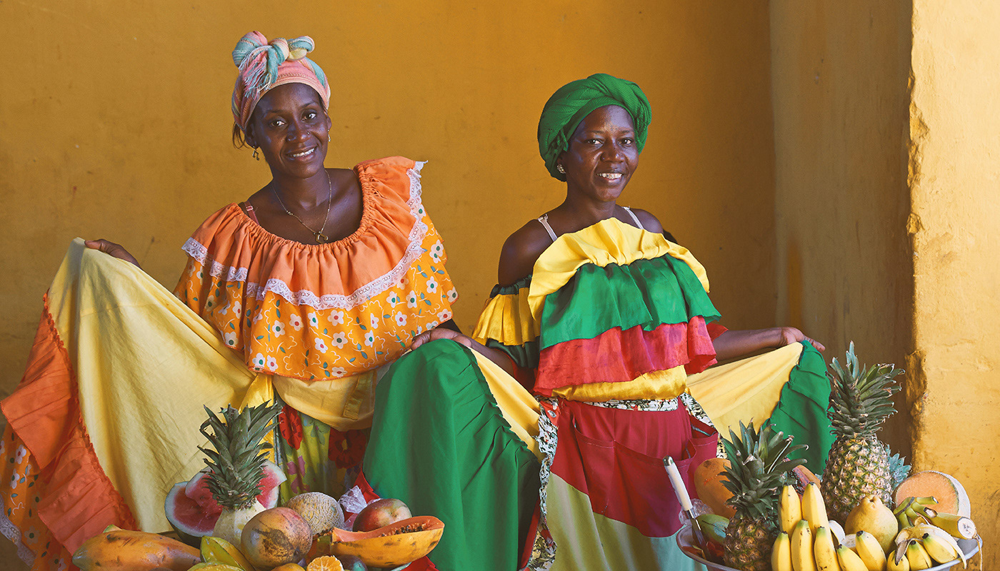
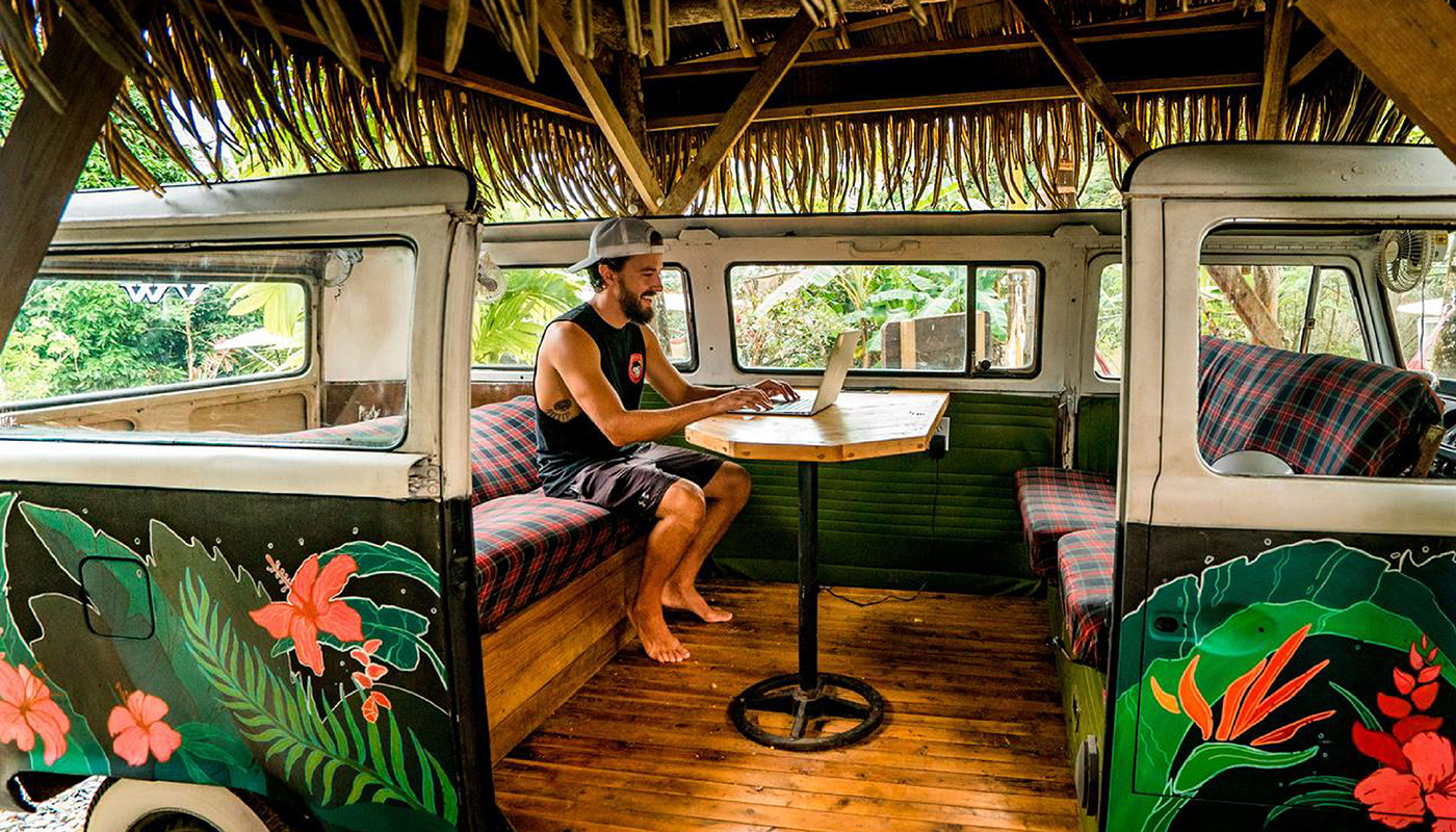
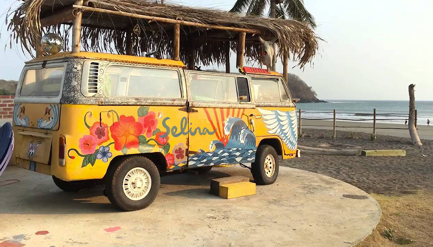
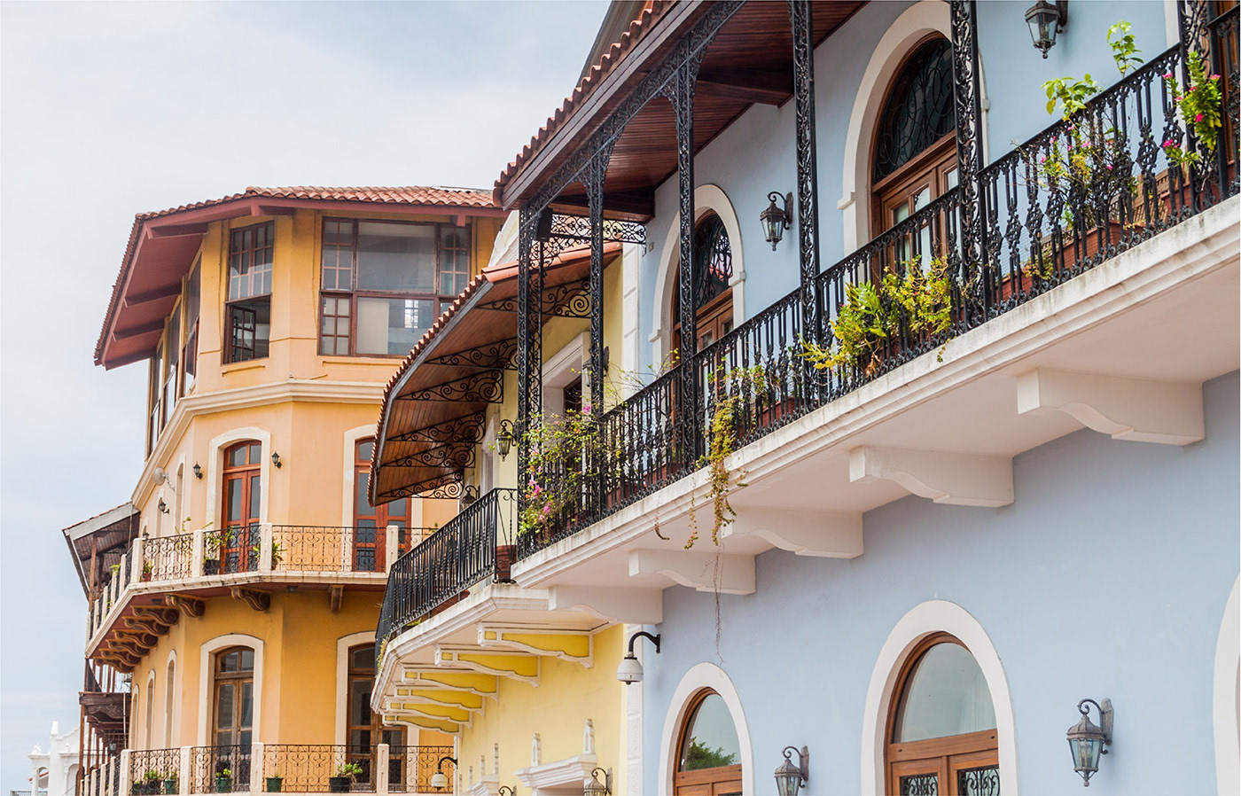
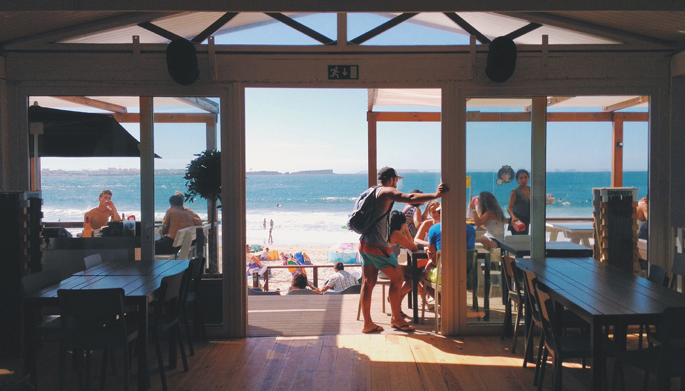
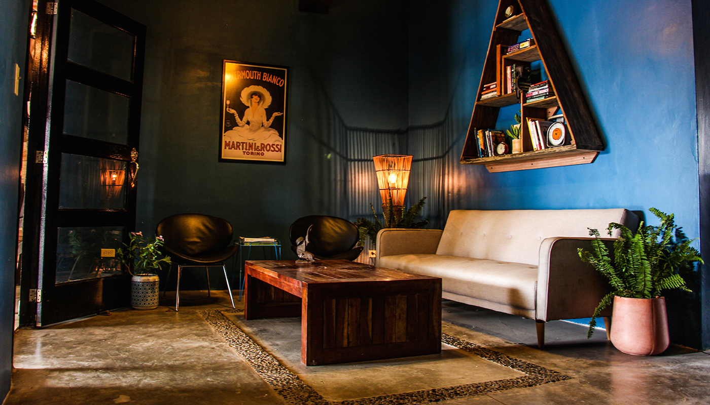
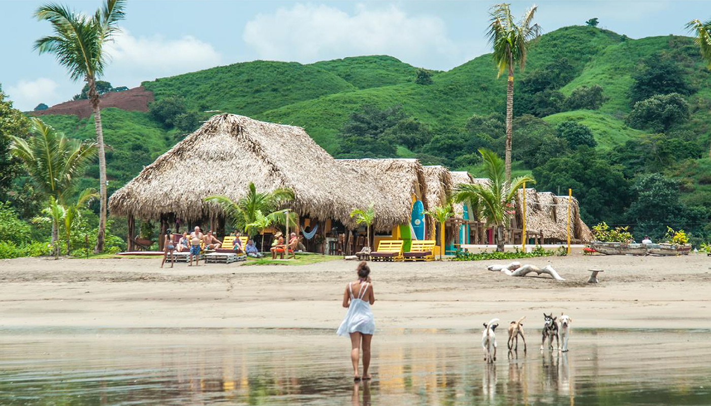
Selina, a fast-growing hospitality brand across Latin America, was shifting its focus. Known for its party-forward vibe aimed at young backpackers, the brand wanted to evolve—appealing to a slightly older, globally minded audience of “macpackers”: curious, mobile professionals seeking culture, inspiration, and community. The goal was to create a new visual and verbal identity that captured the richness of each location while aligning with this more mature, experience-driven traveler.
Approach
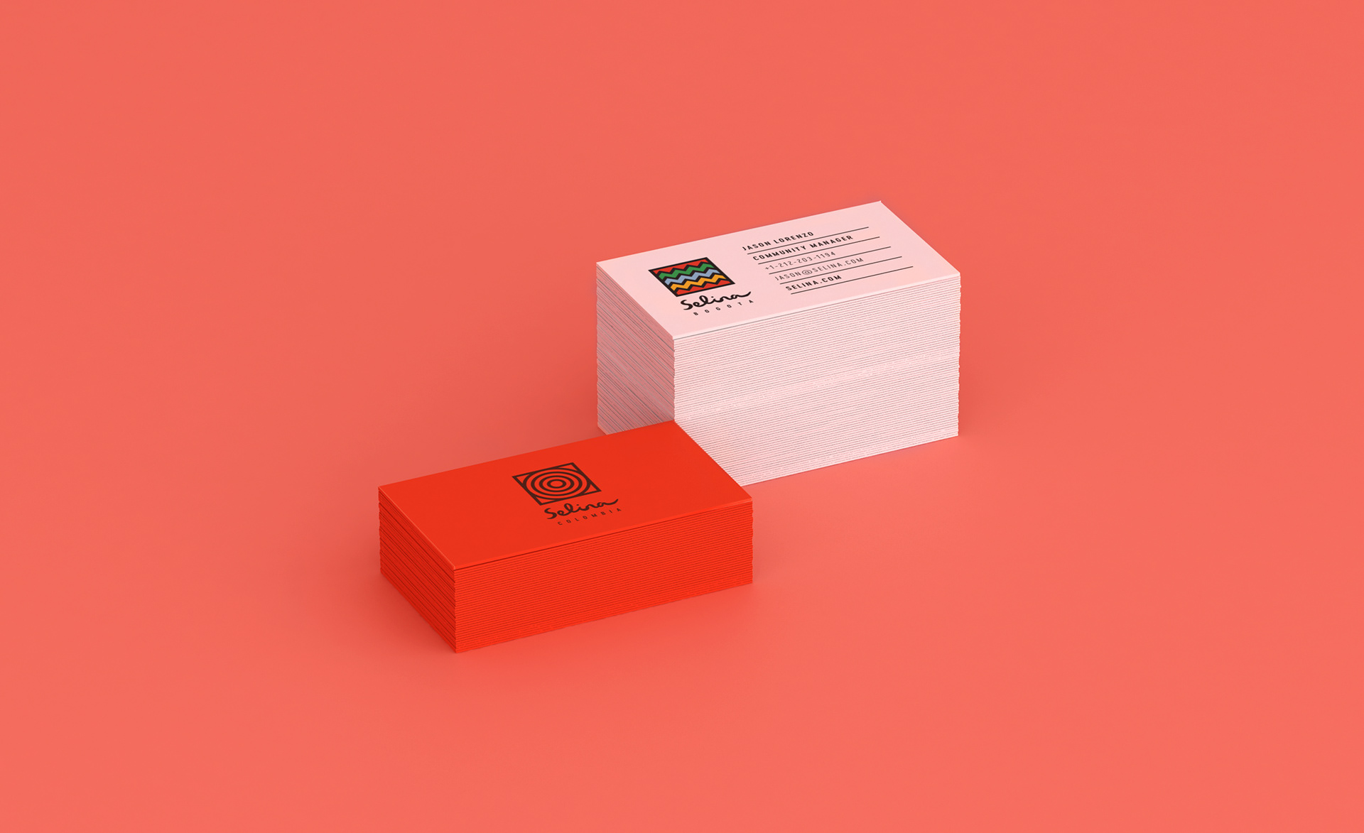
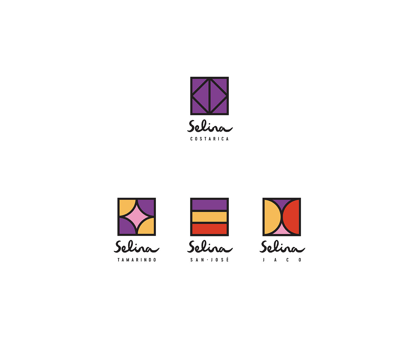
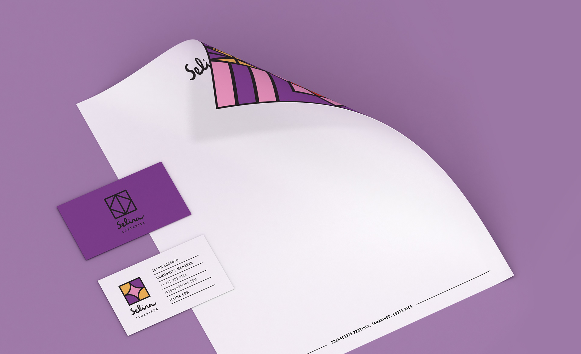
The brand direction took inspiration from the essence of travel itself—messy, personal, and transformative. A custom logotype was developed to reflect the human, handcrafted nature of Selina’s offering. The letters flow organically, like a journal signature or a path drawn from memory. Their imperfect rhythm mirrors the movement and spontaneity of Latin American life and the cultural exchange happening within each Selina property.
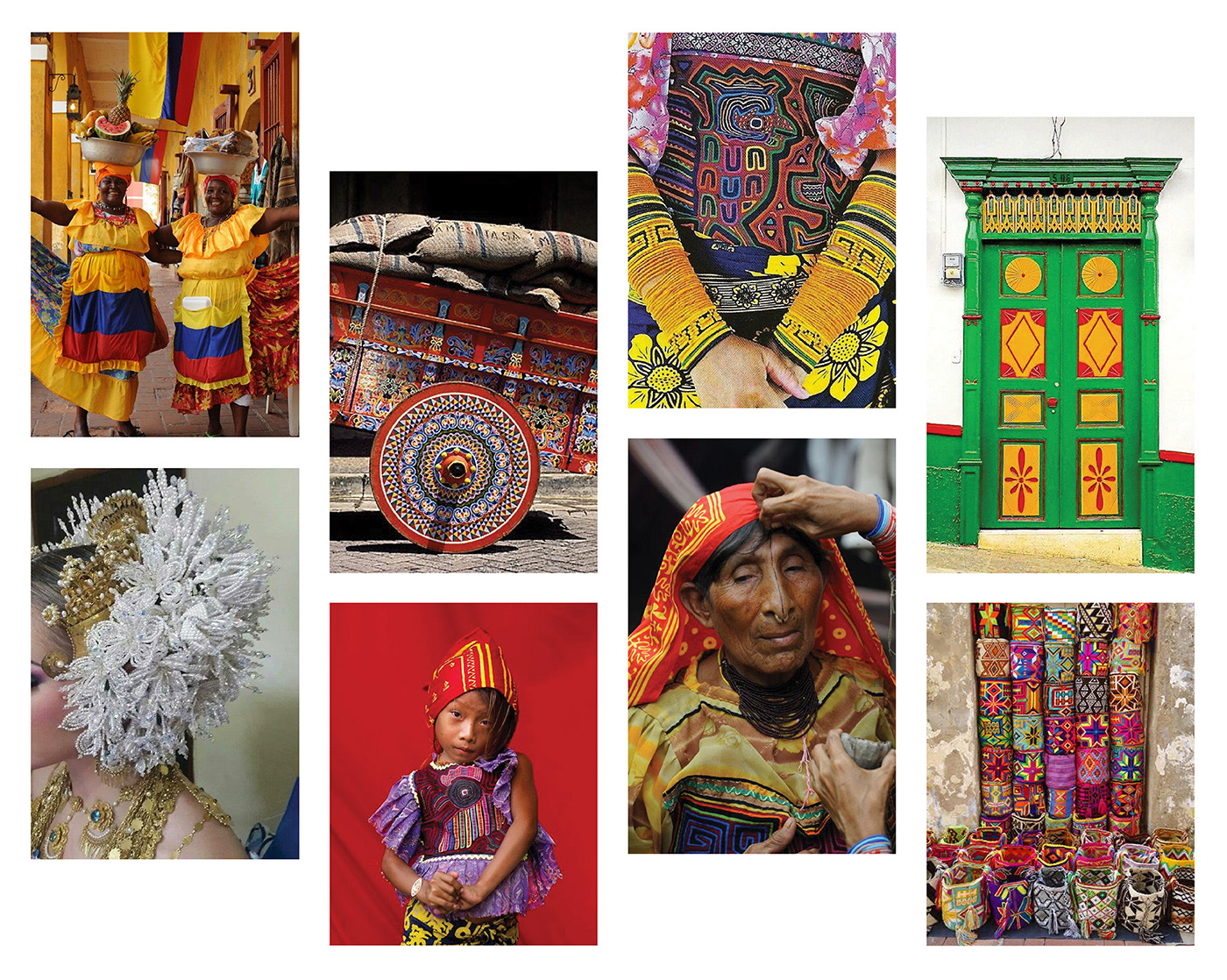
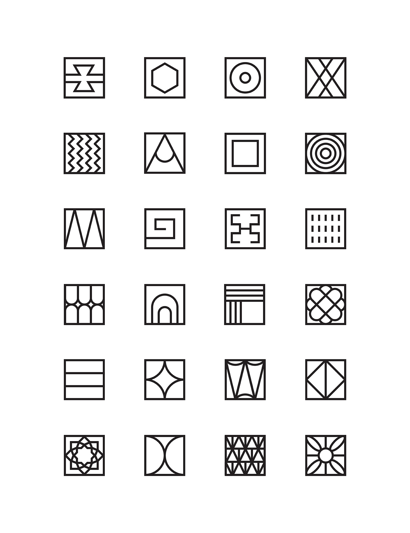
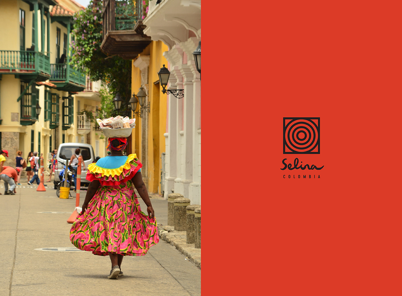
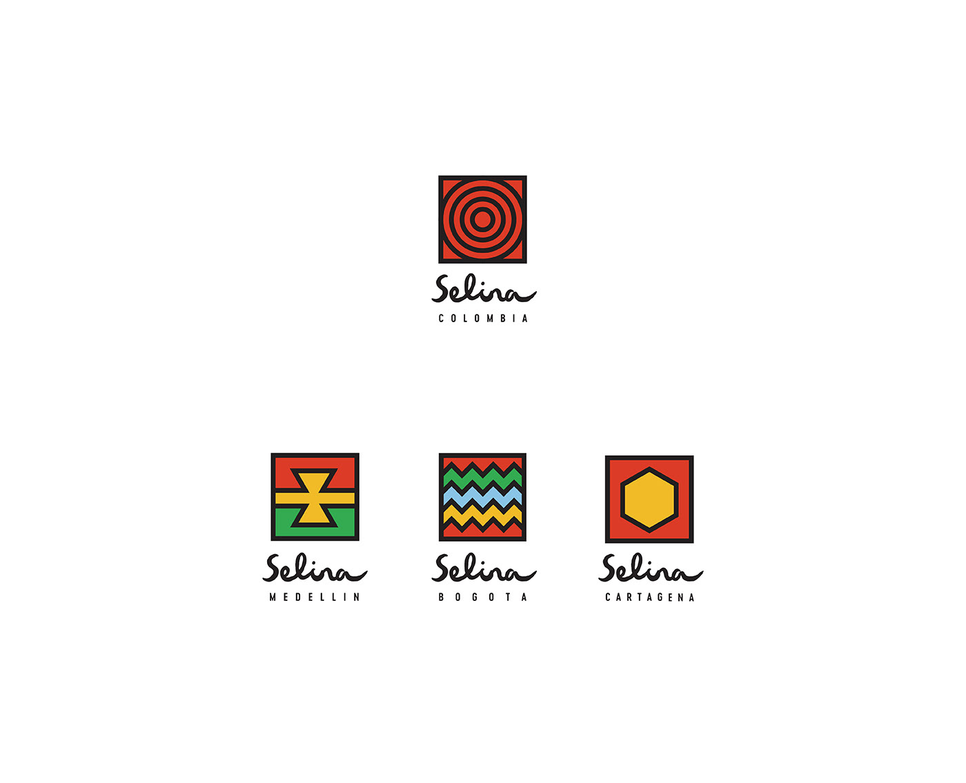
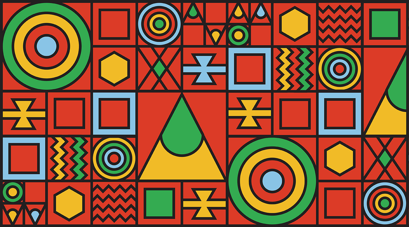
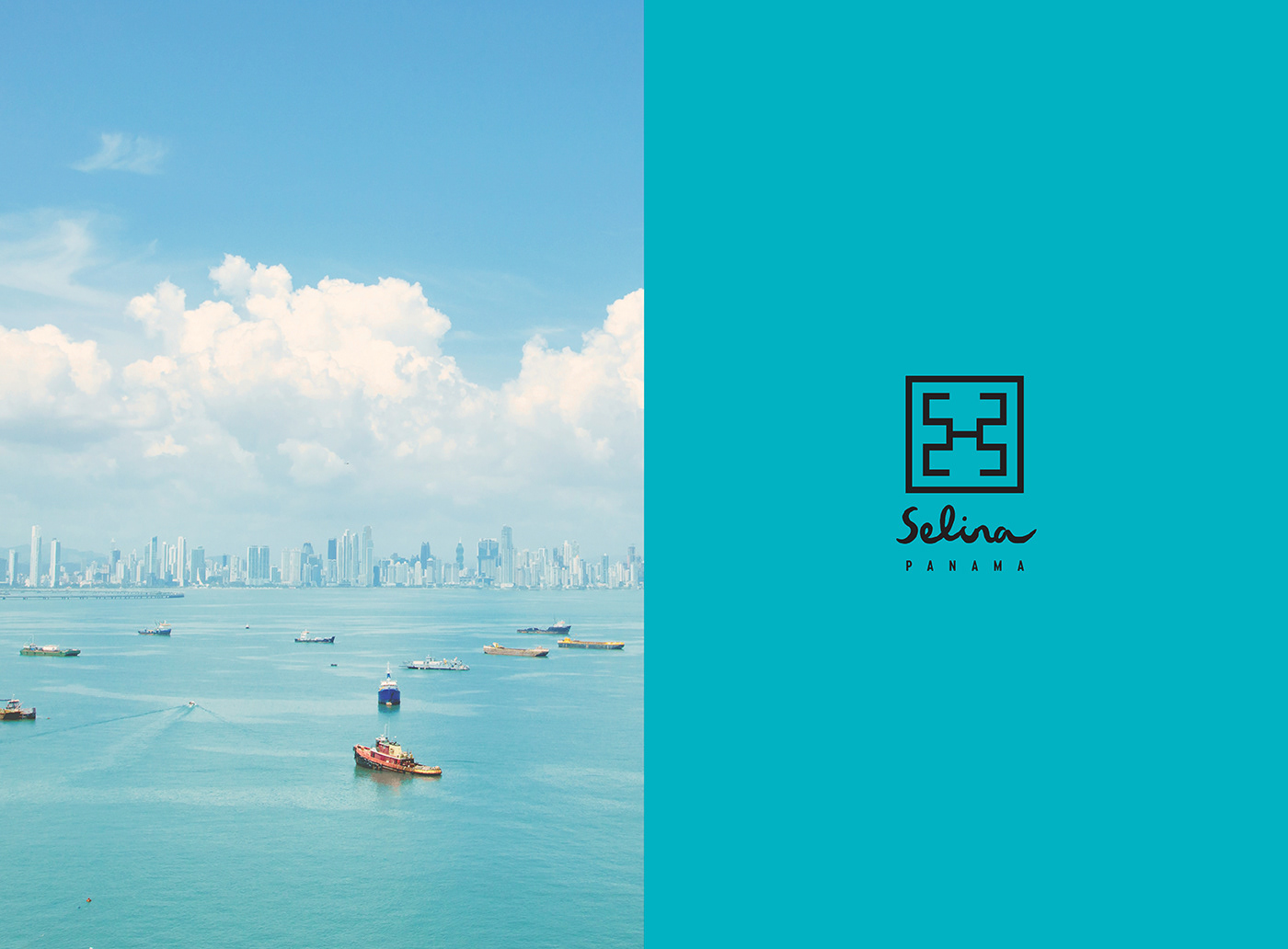
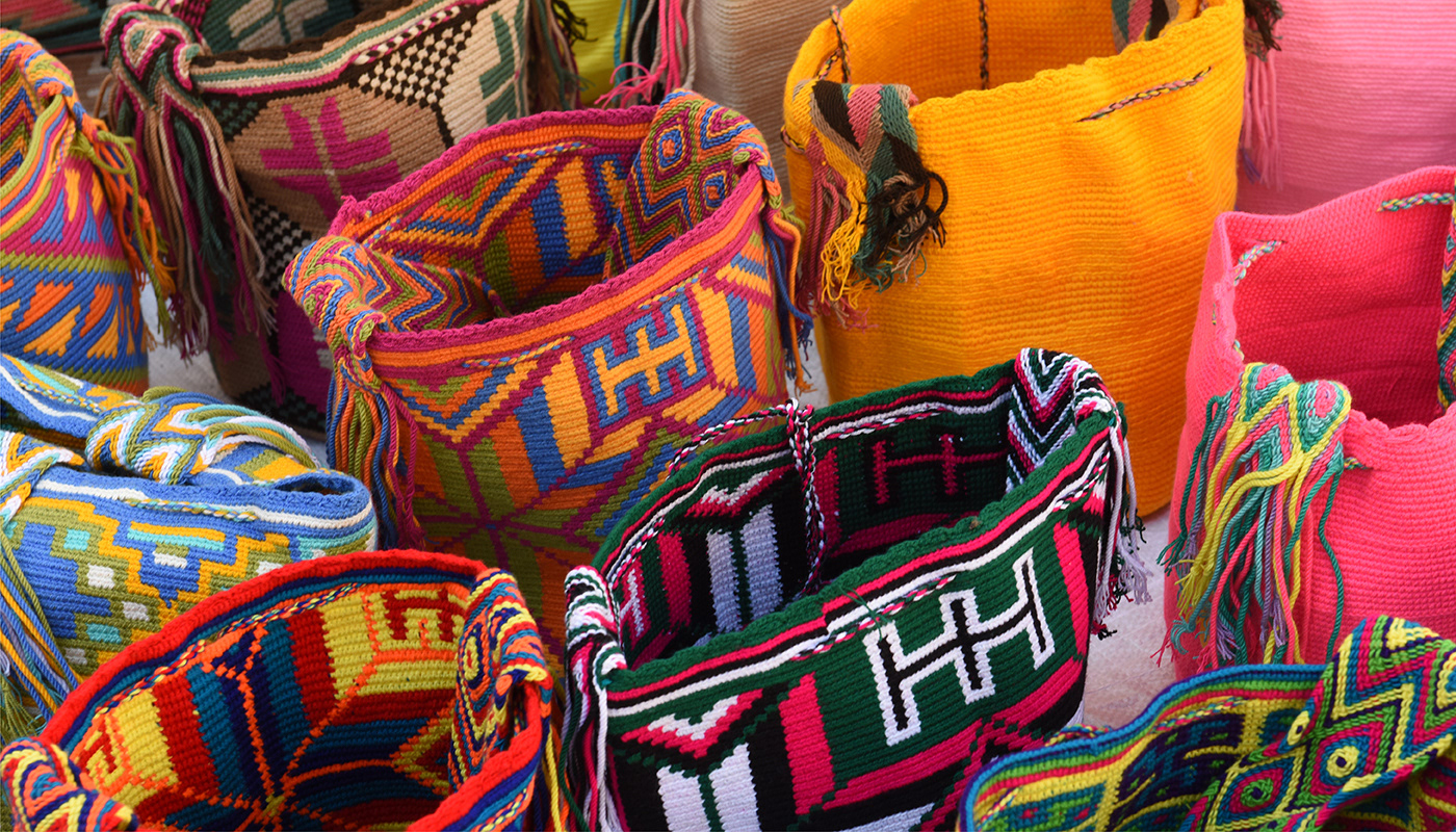
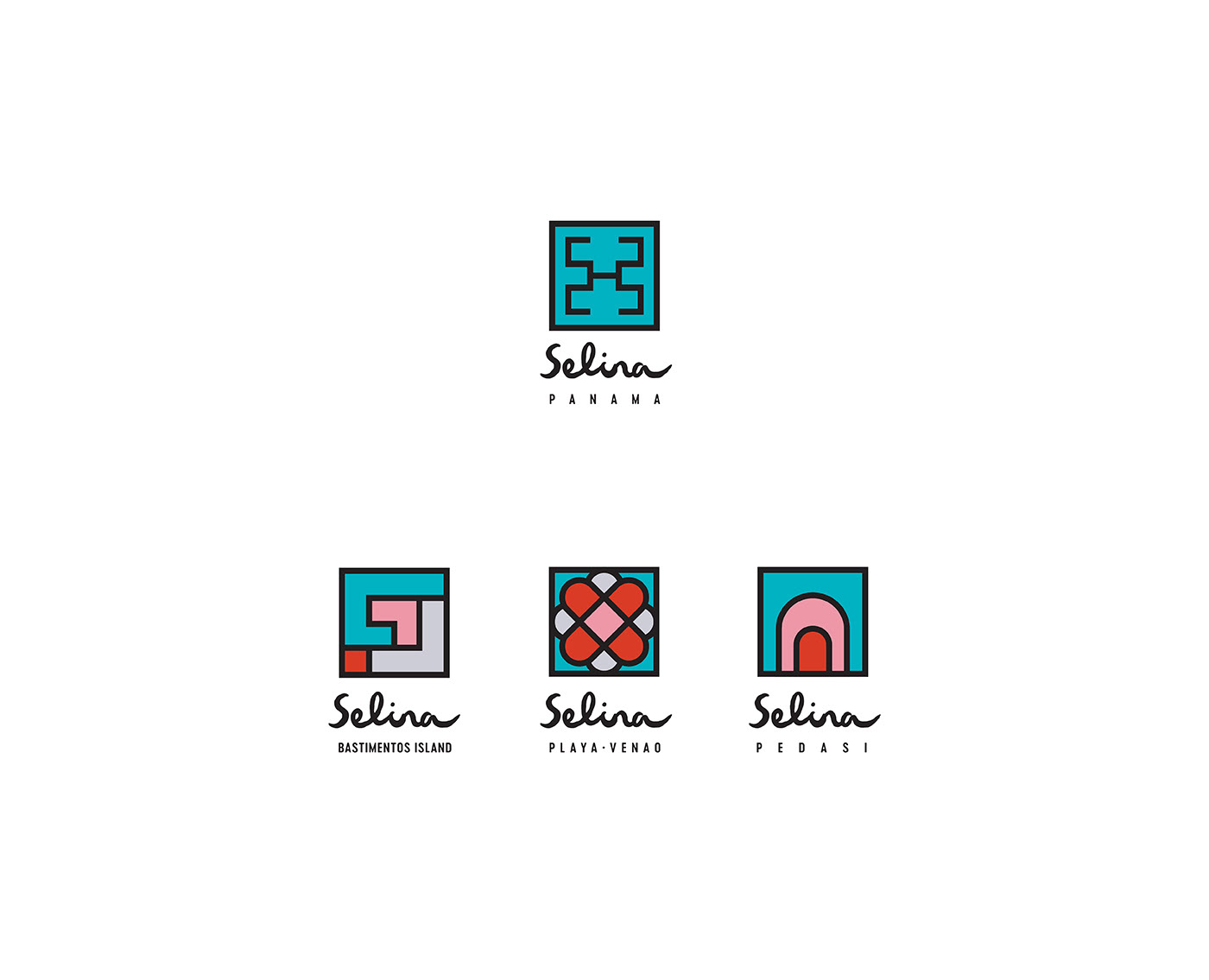
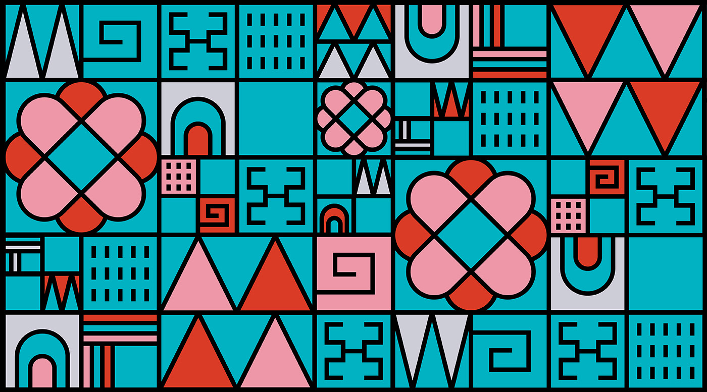
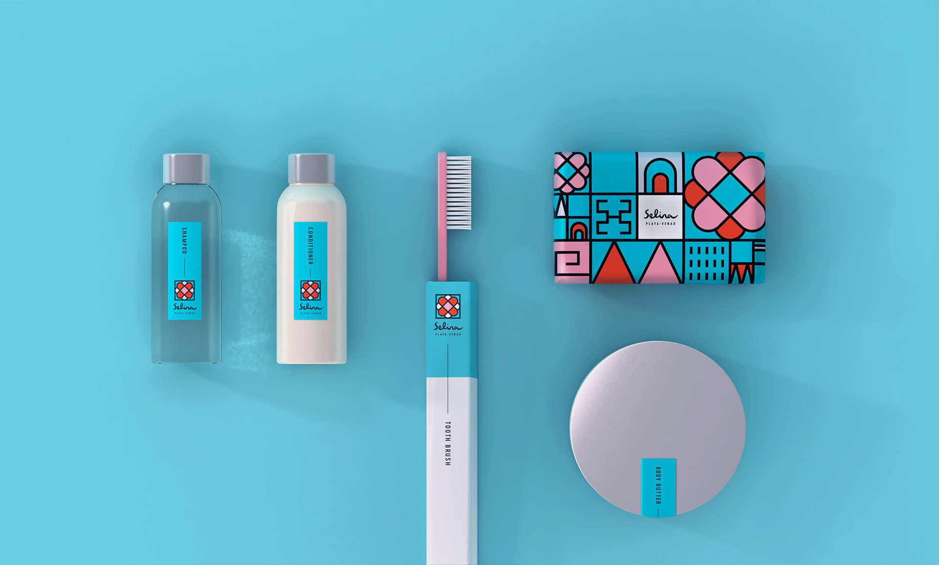
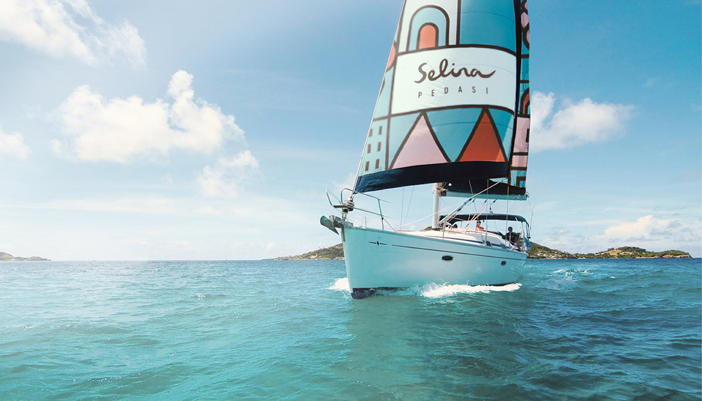
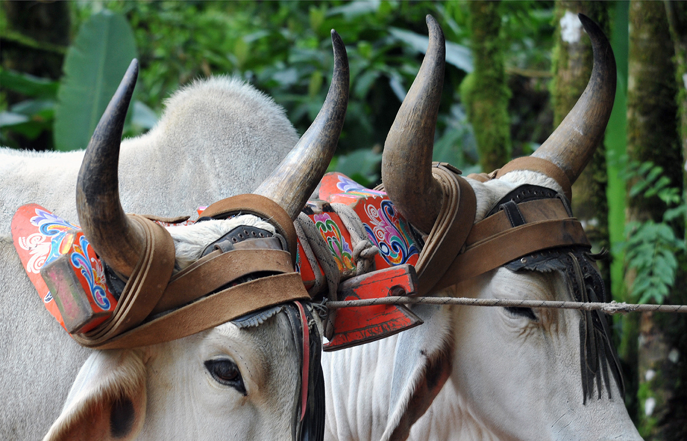
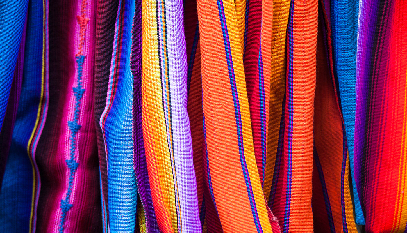
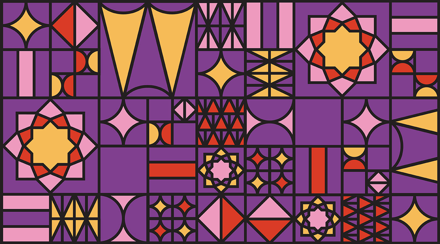
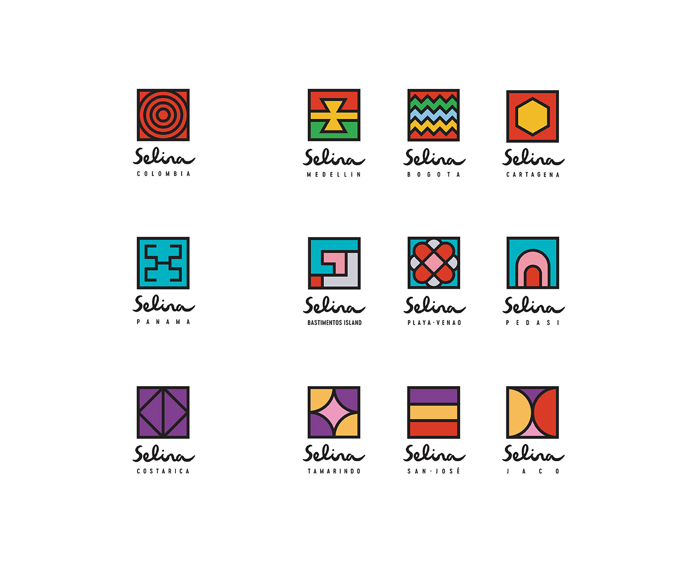
For sub-brands and locations—Panama, Costa Rica, Colombia—I introduced a secondary typographic system inspired by regional indigenous patterns and traditional crafts. The clean, wide-lettered sans serif was paired with bespoke graphic textures rooted in local weaving, beading, and body markings, giving each place its own unique visual fingerprint while staying connected to the core brand.
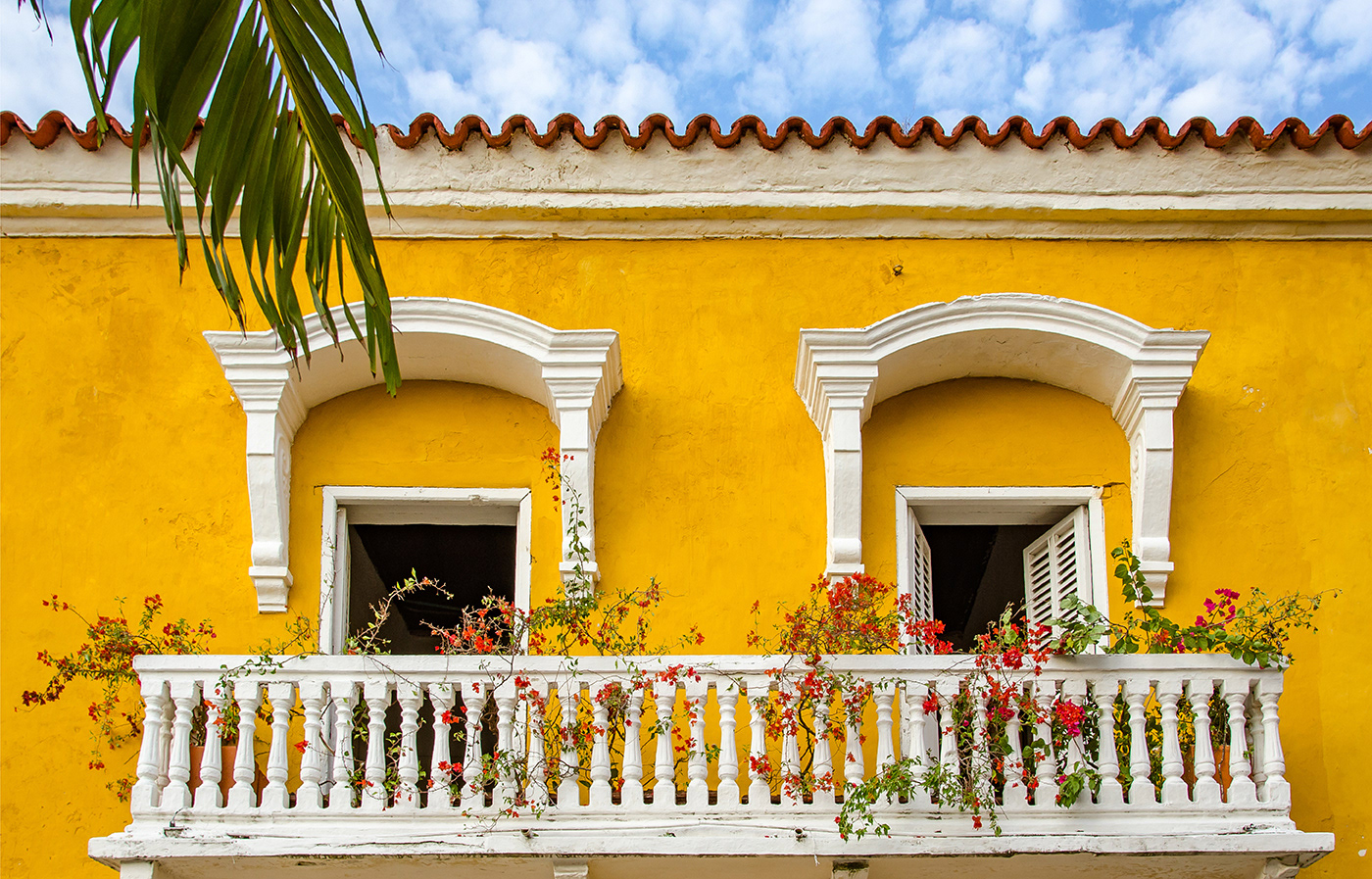
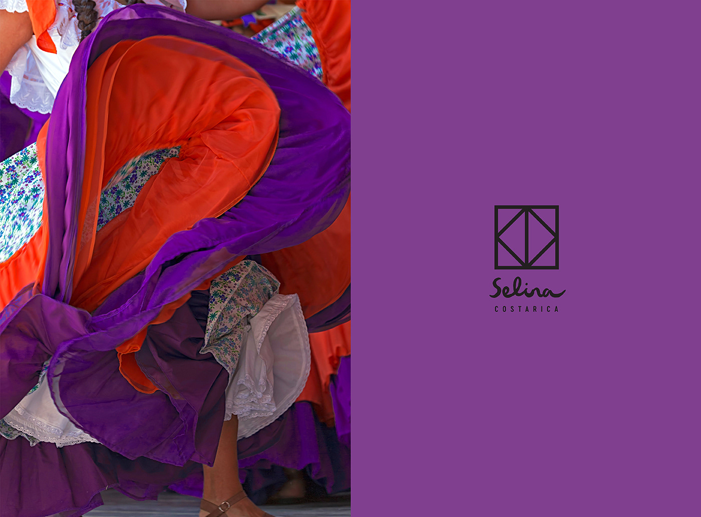
Selina’s base palette of black and white created consistency across locations, while bold accent colors were drawn directly from the pigments found in local textiles and artisan work. The result was a layered identity system: grounded in heritage, but expressive enough to feel contemporary and flexible.
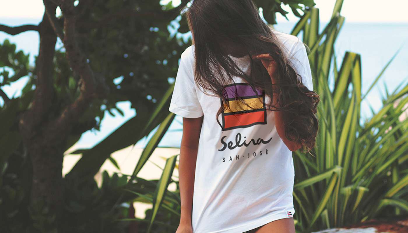
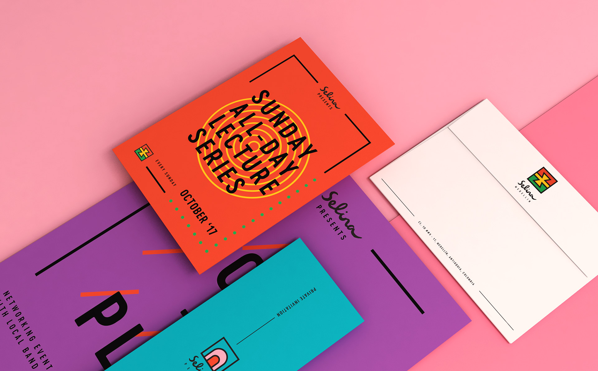
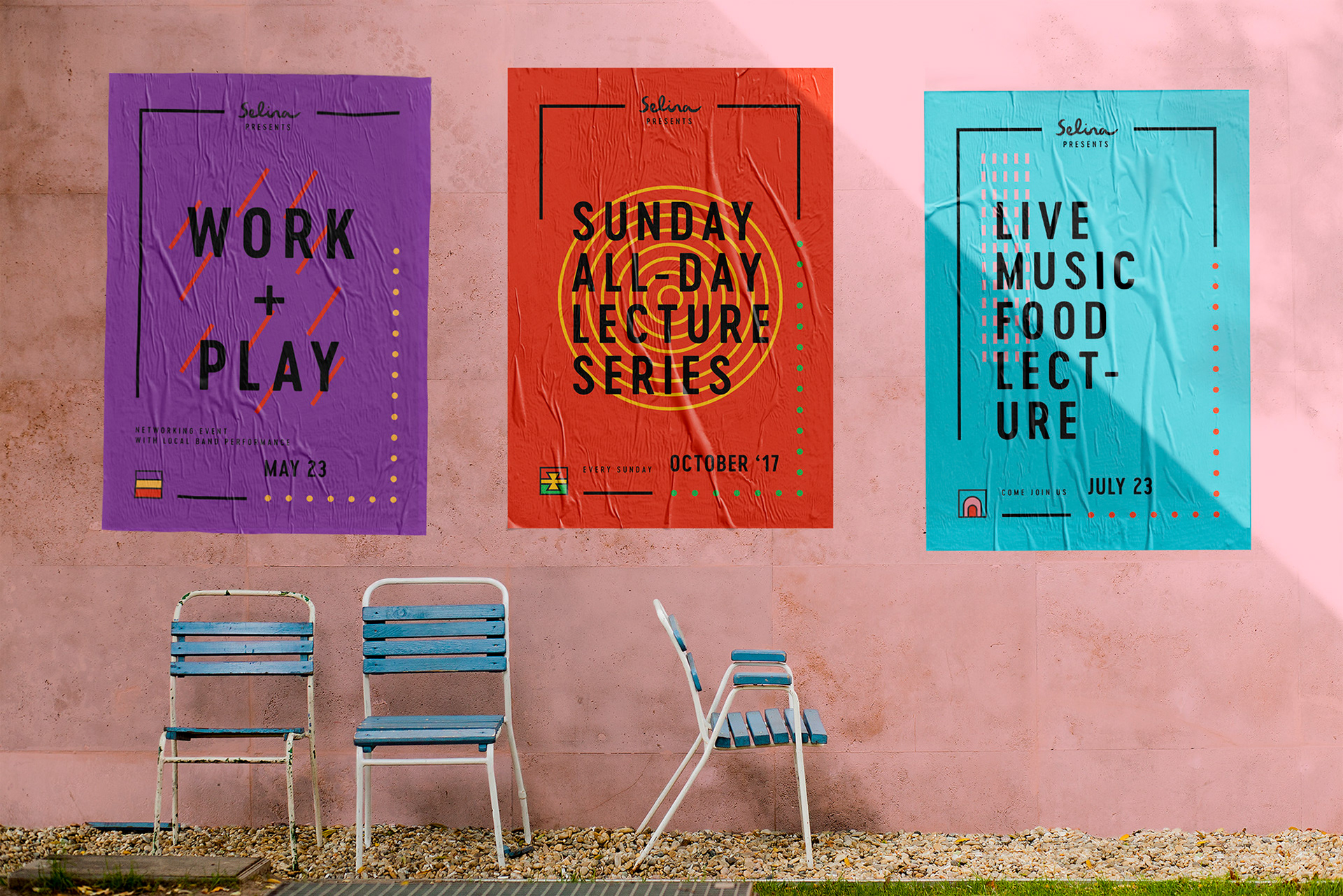
These elements extended across everything—from stationery, surfboards, and swimsuits to toiletries, posters, and wearable merchandise. The system was built to travel well, literally and figuratively—meeting guests wherever they are in their journey, and inviting them to connect more deeply with the culture around them.
__
Brand Strategy, Brand Identity