Overview
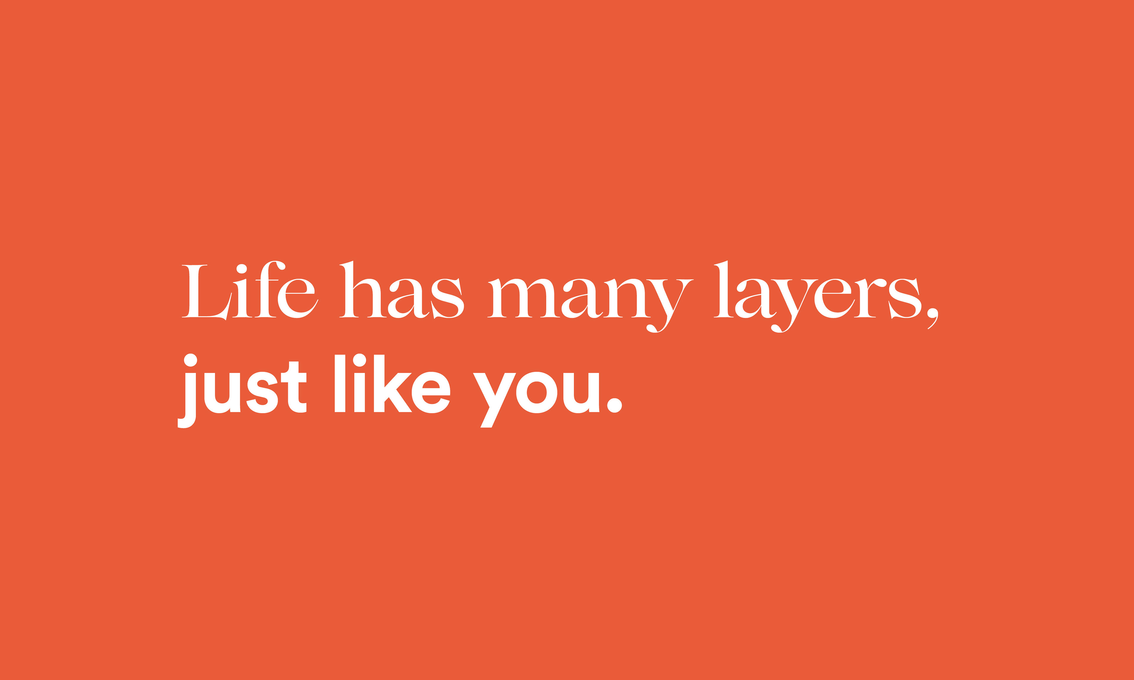
This project set out to create a new kind of residential rental brand—one designed for modern living: flexible, personal, and rooted in community. The goal wasn’t just to build a brand, but to signal a shift in how people think about home, belonging, and the connections between them.
Approach
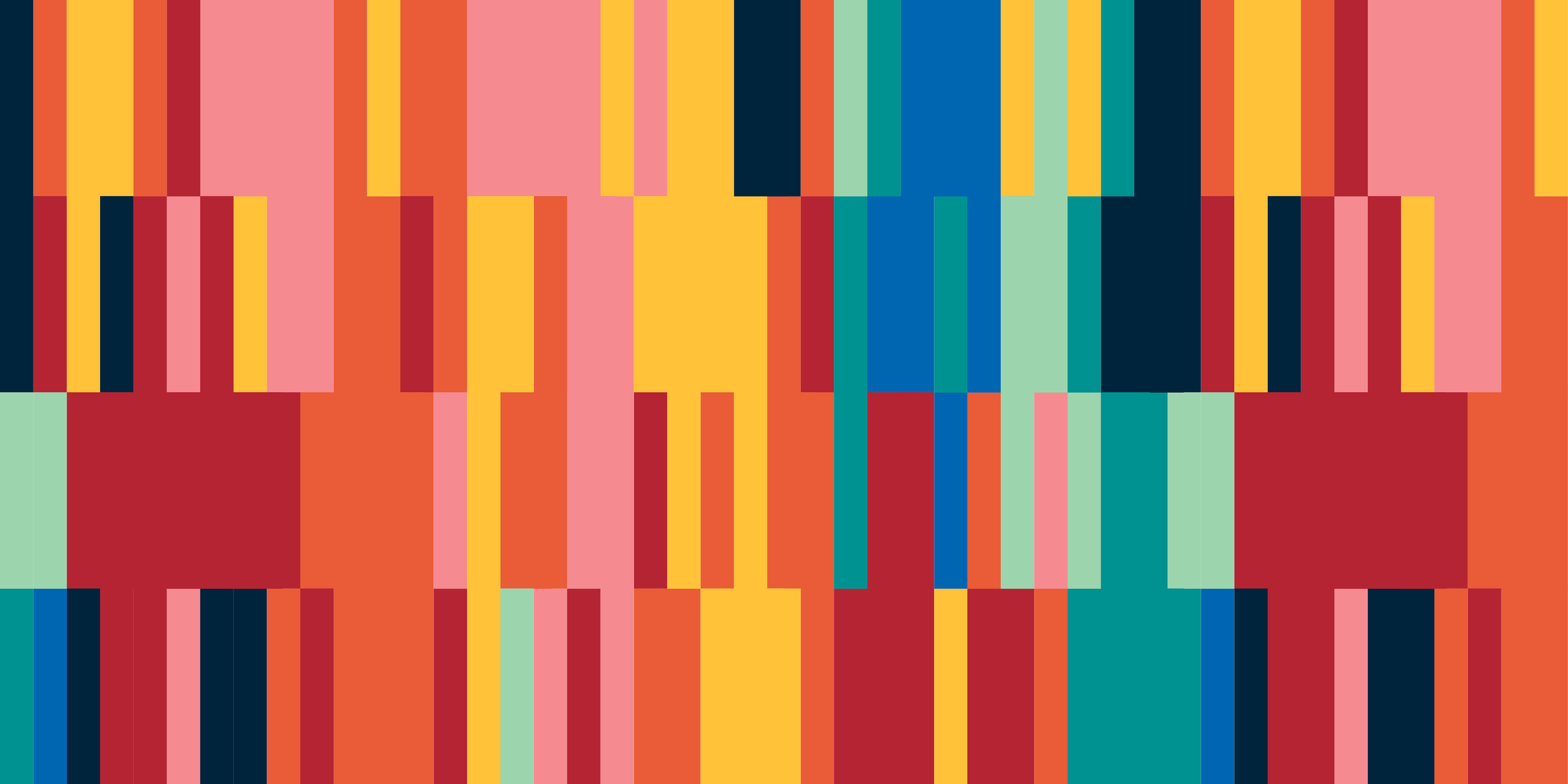
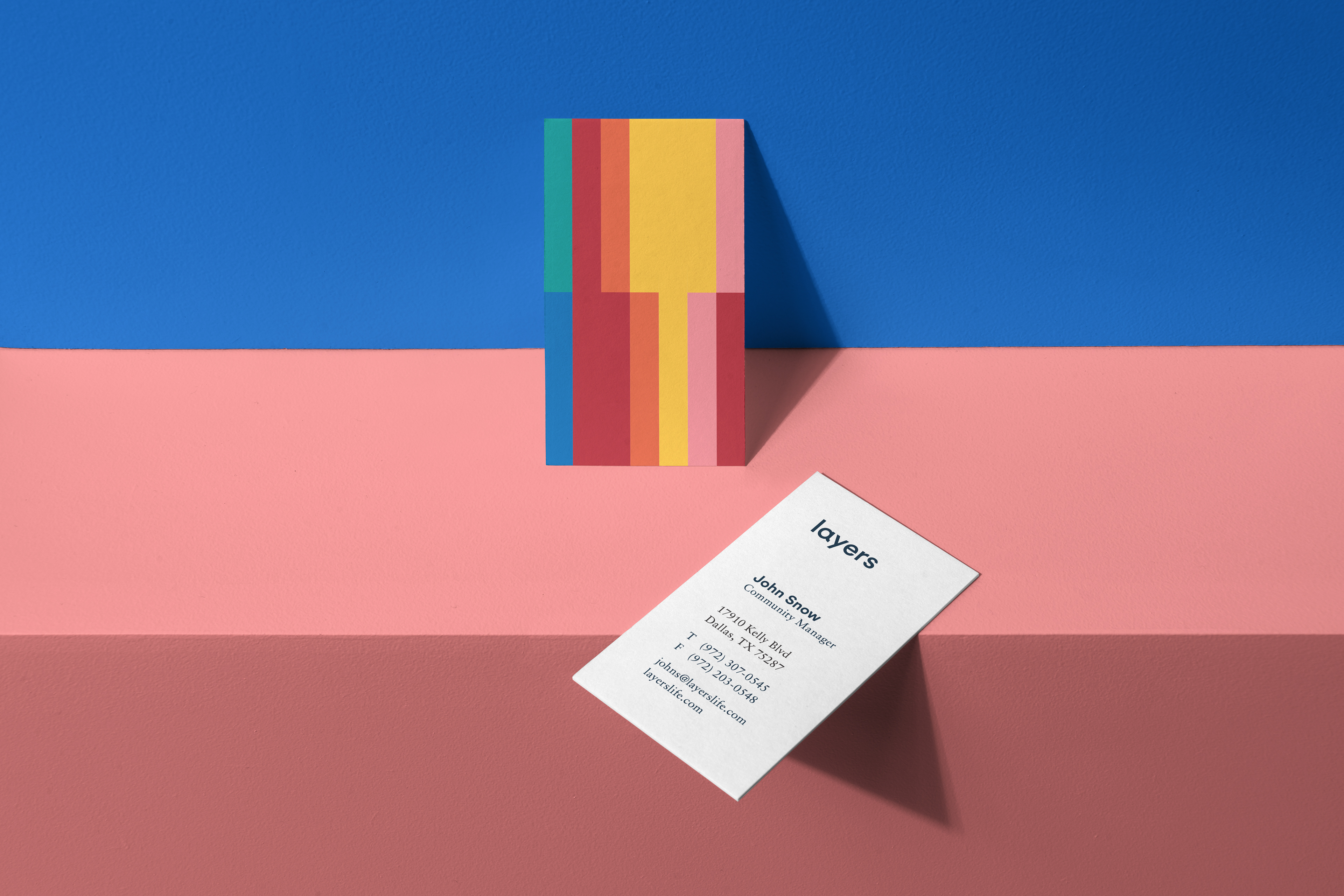
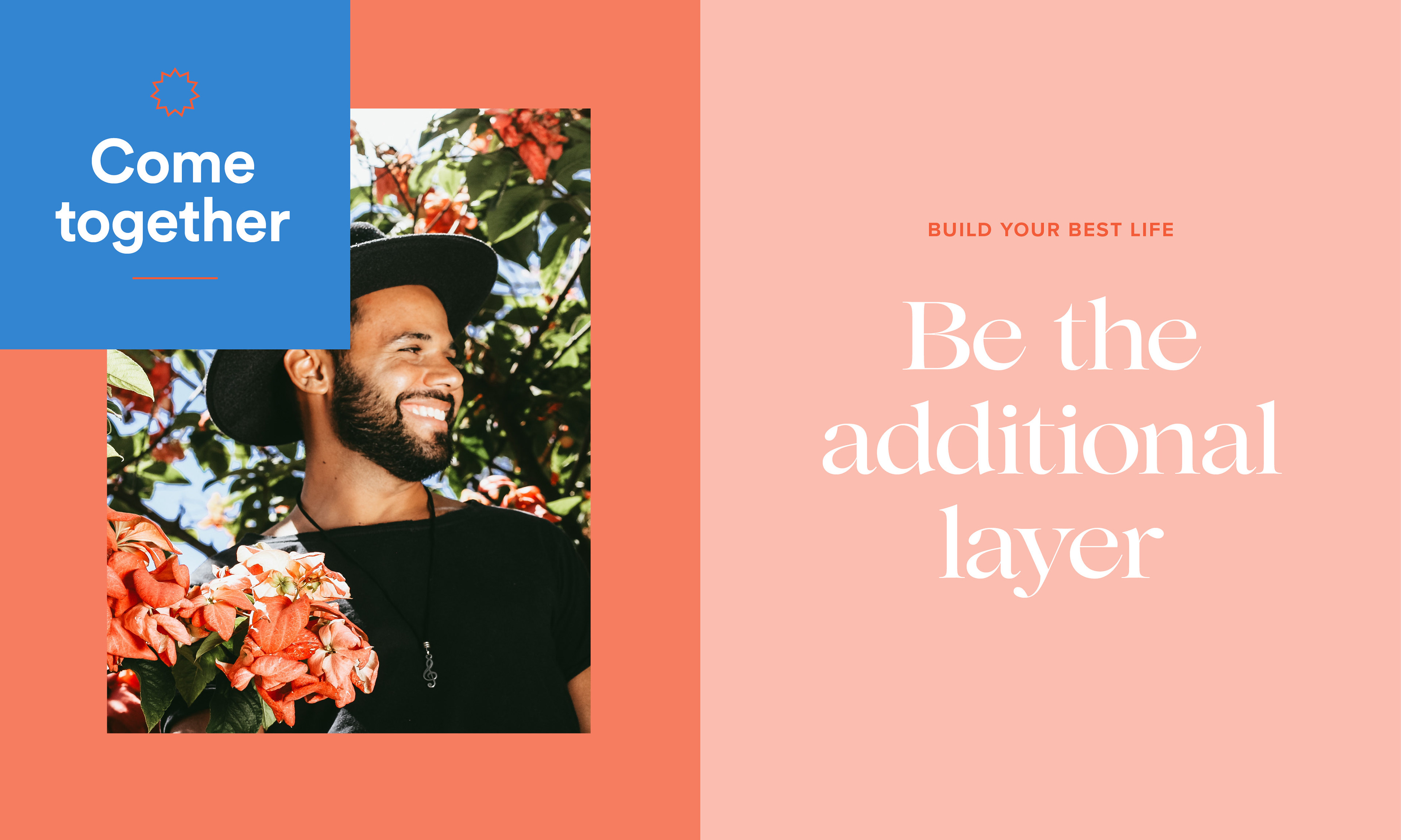
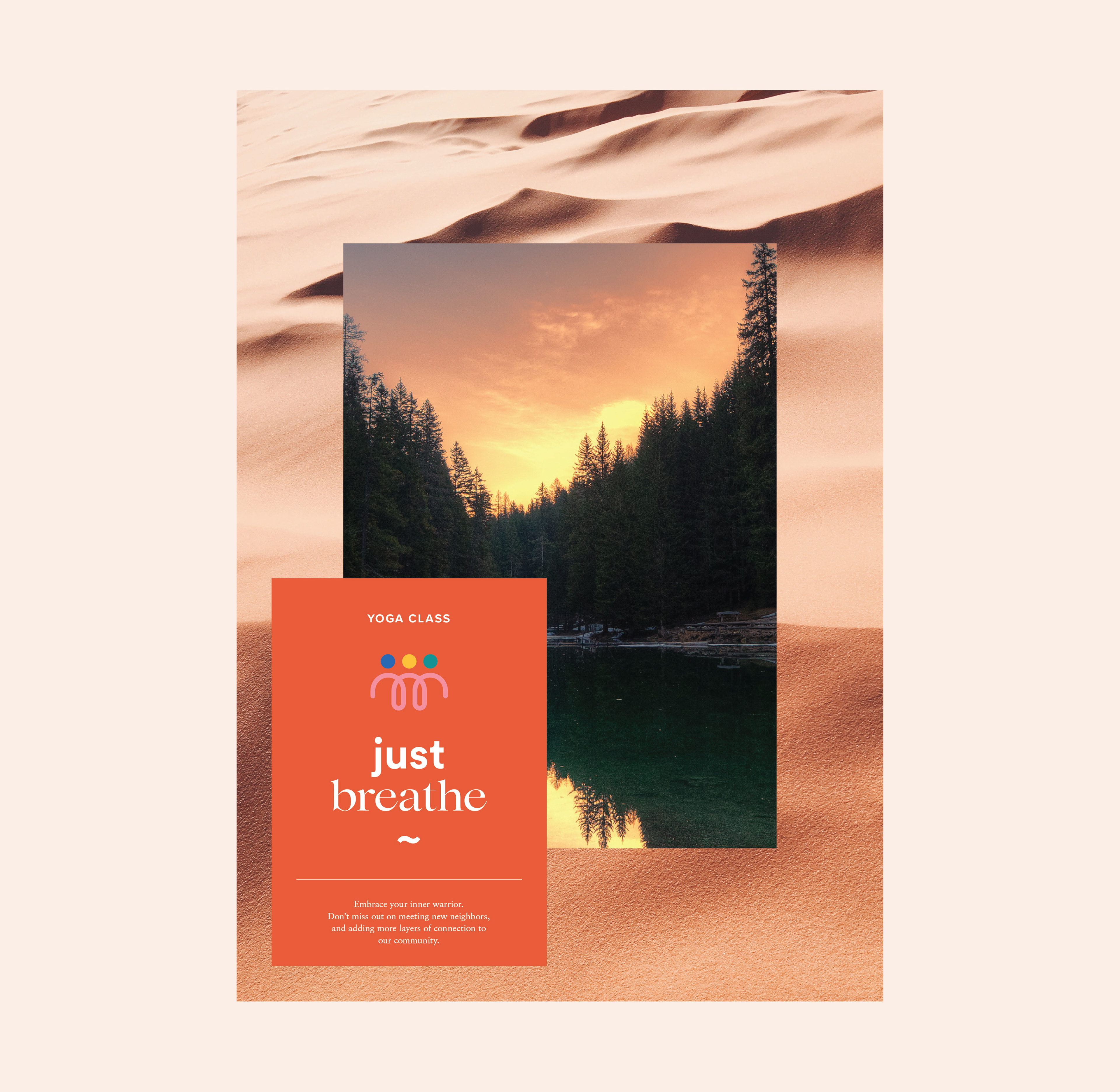
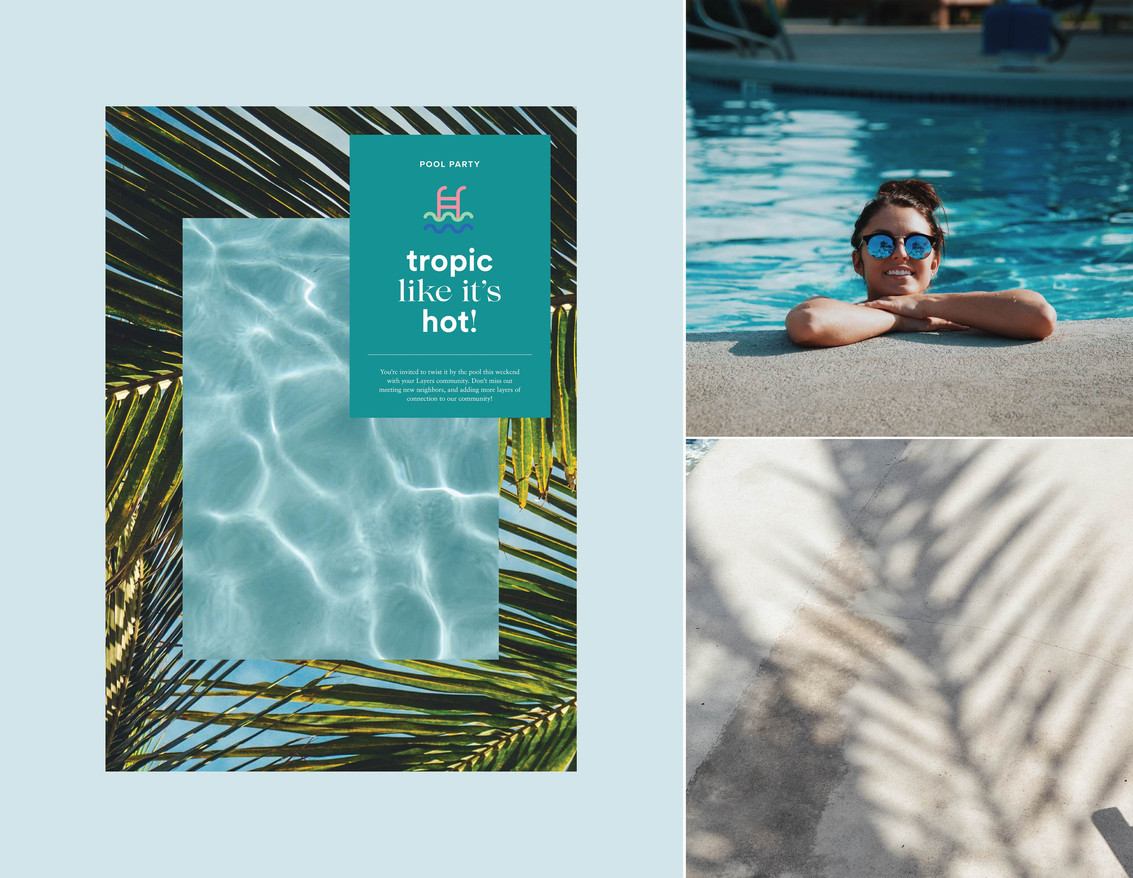
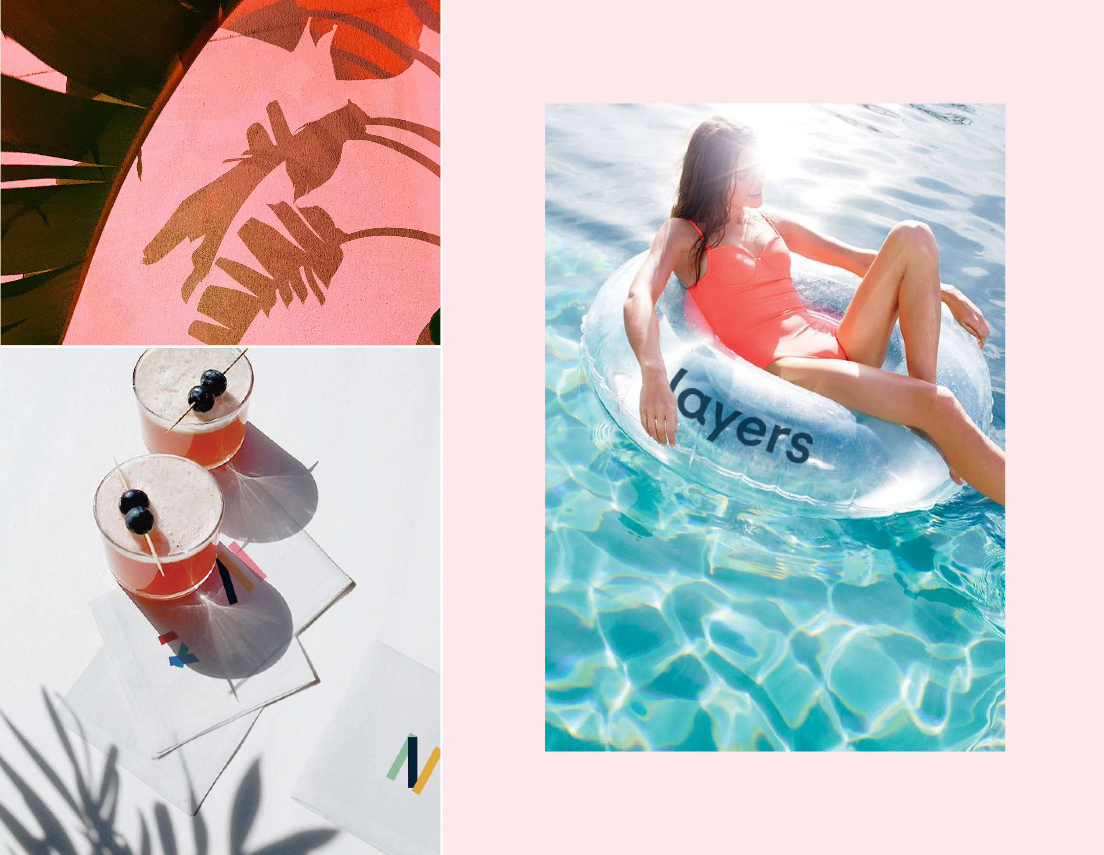
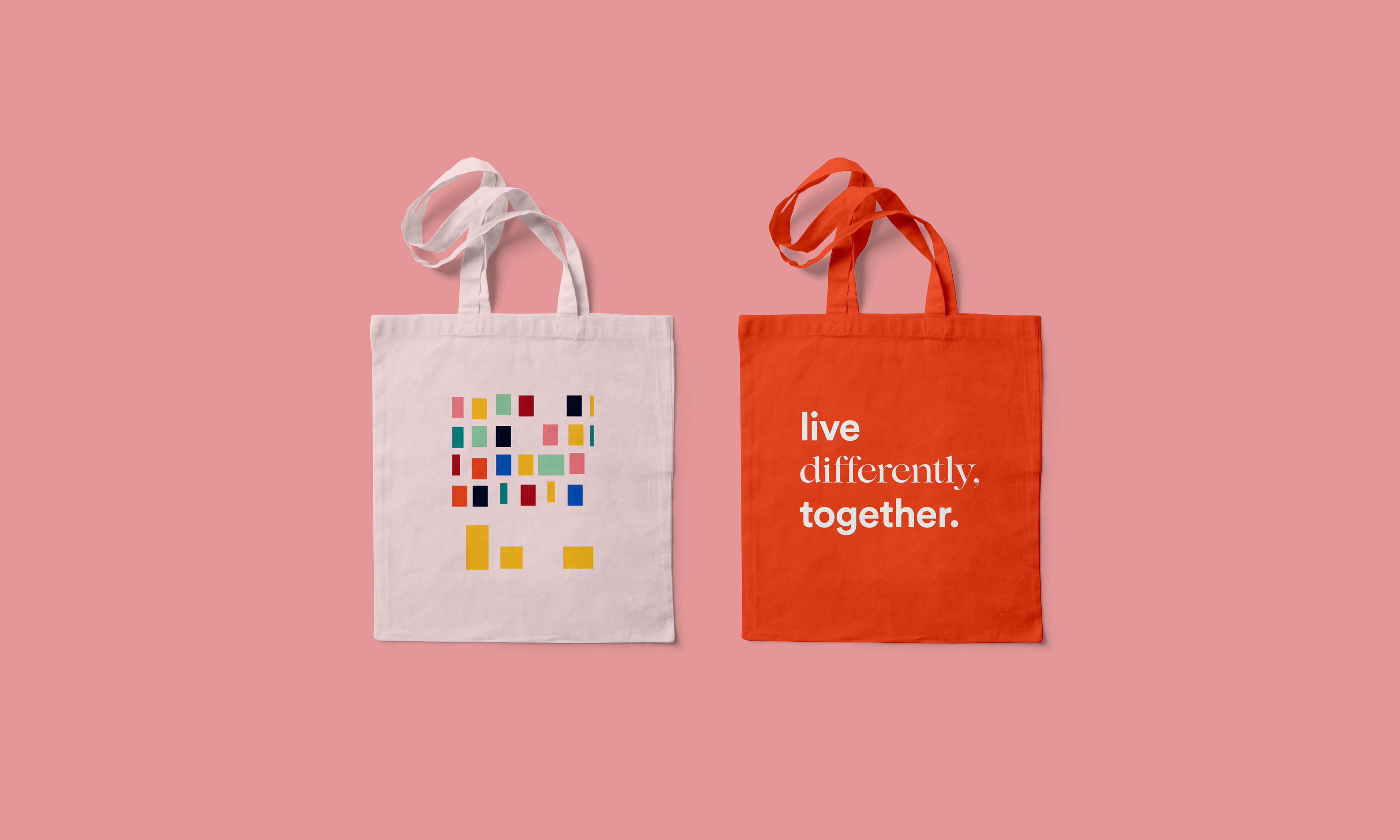
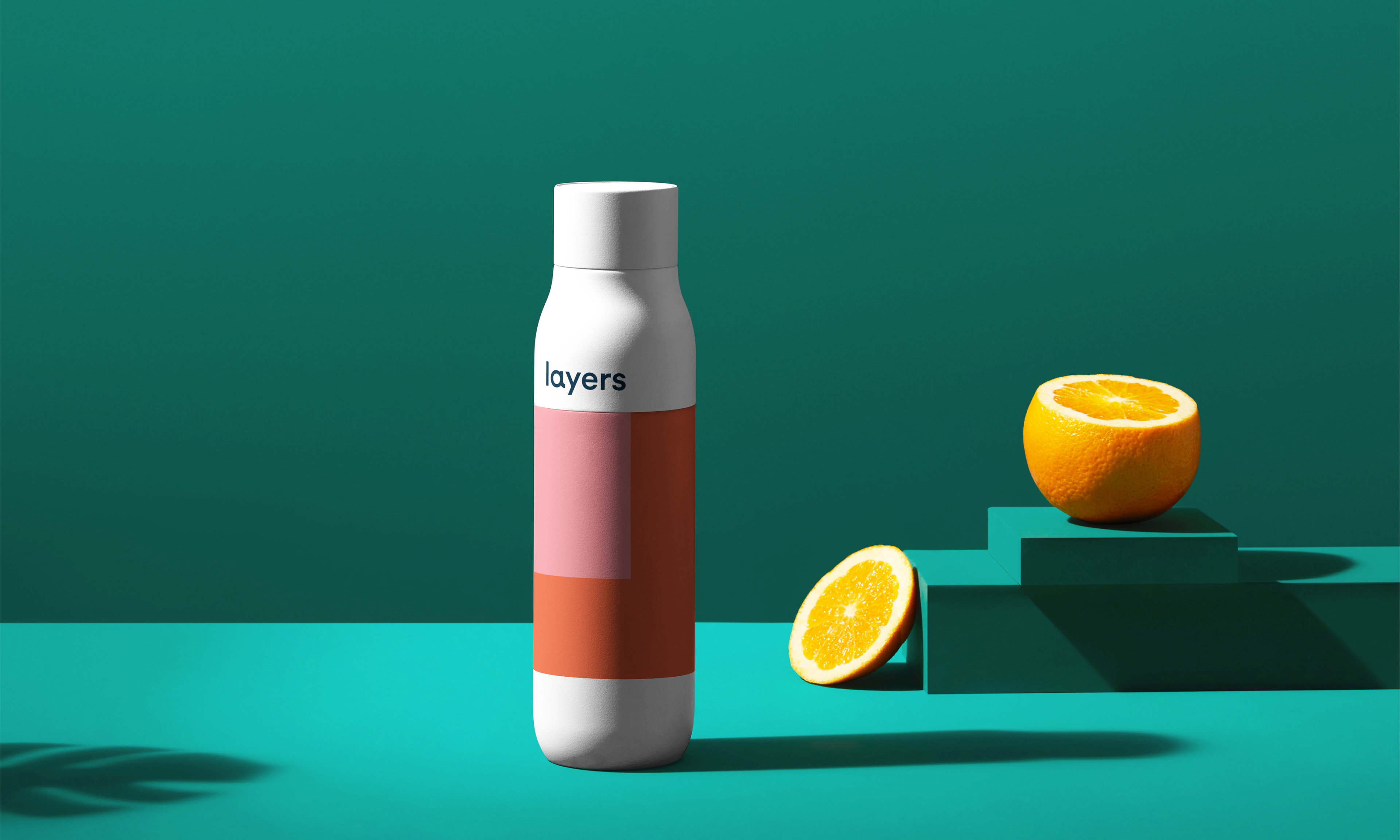
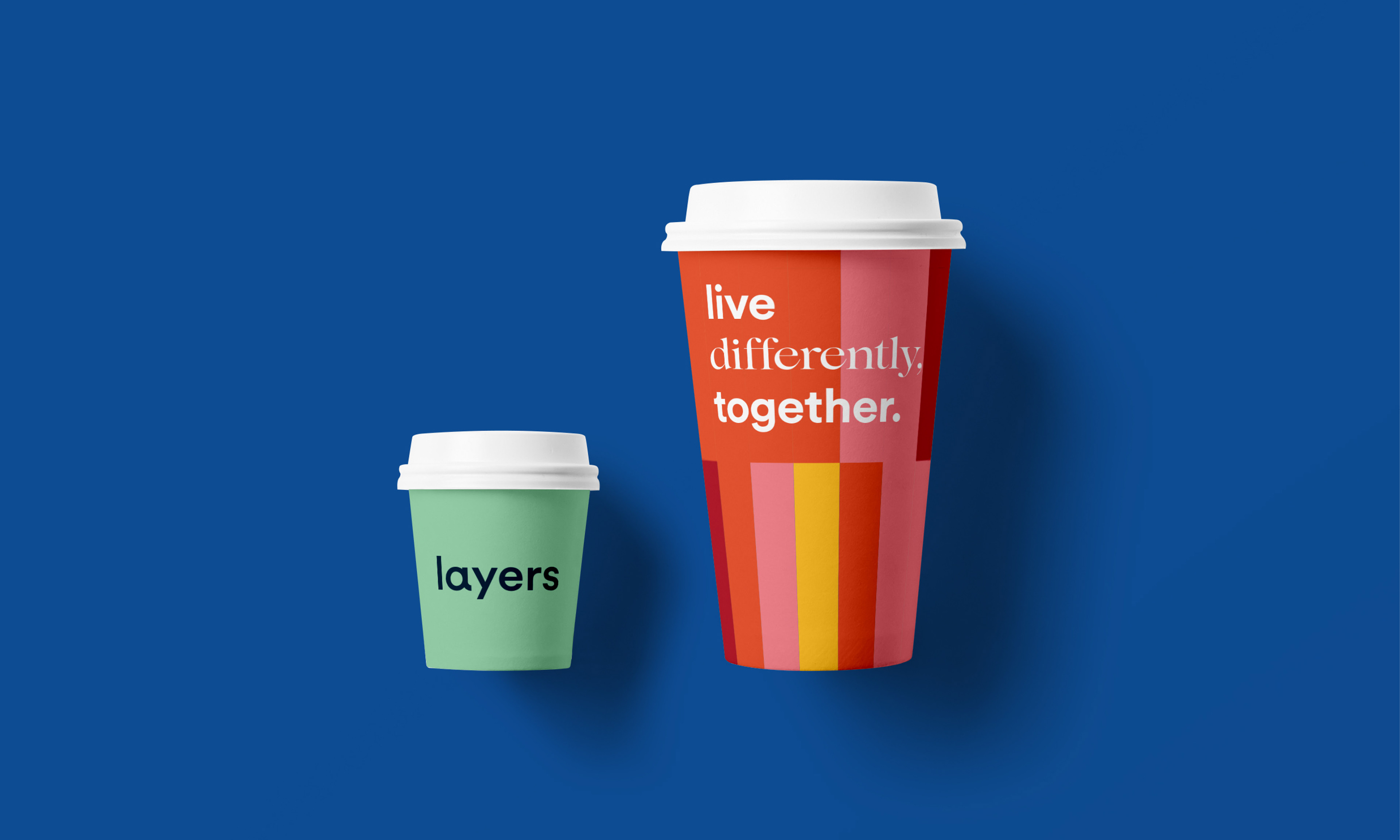
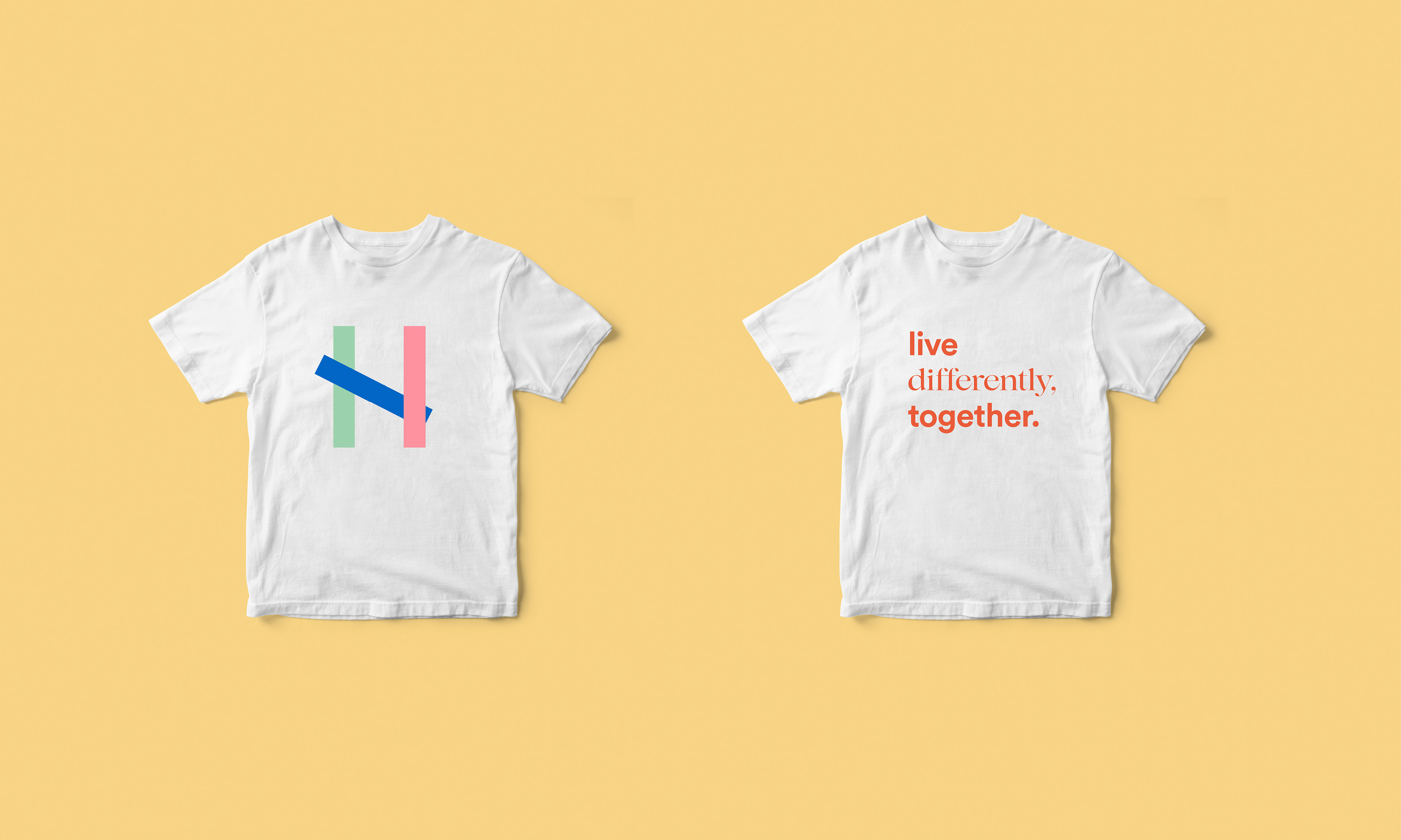
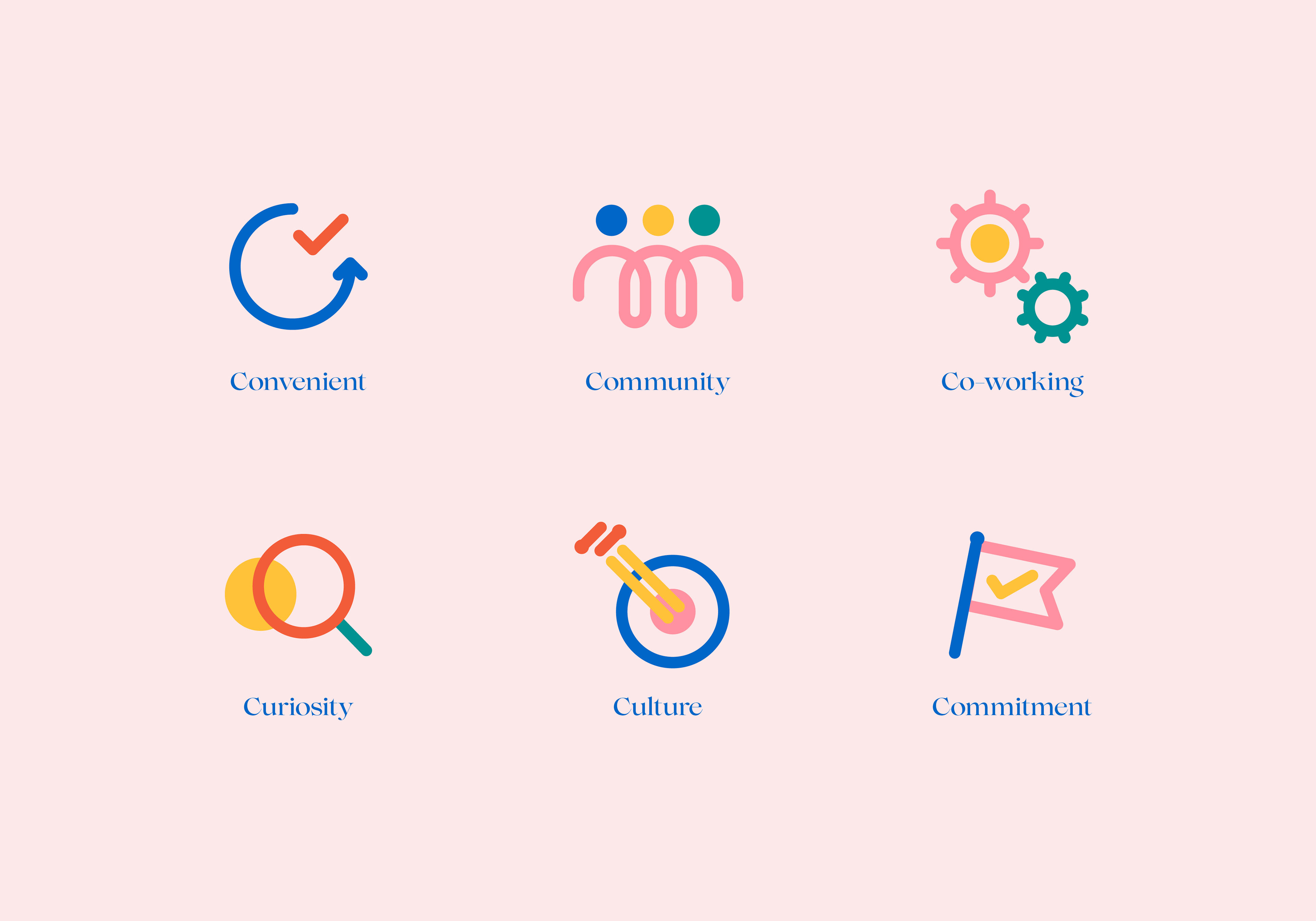
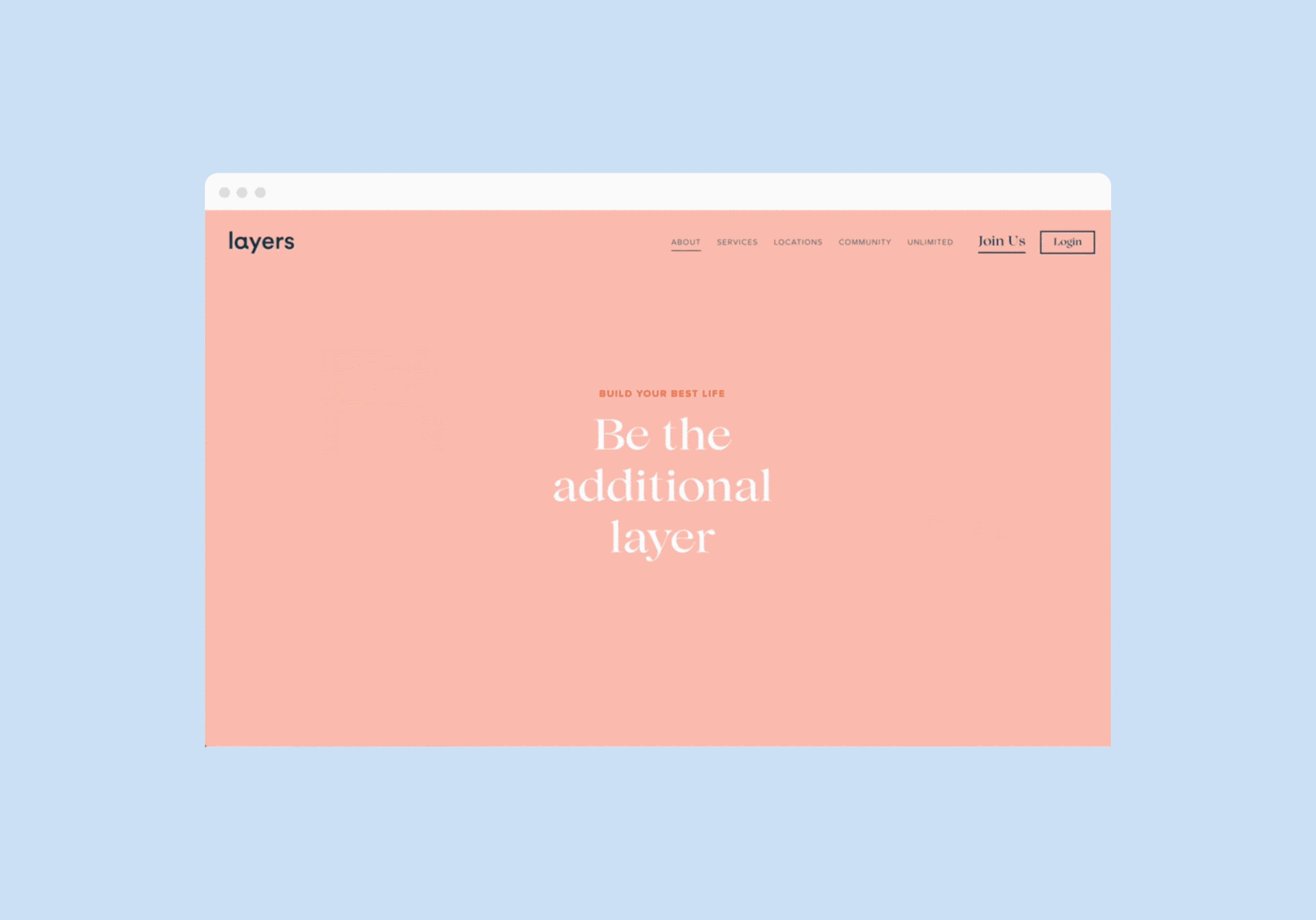
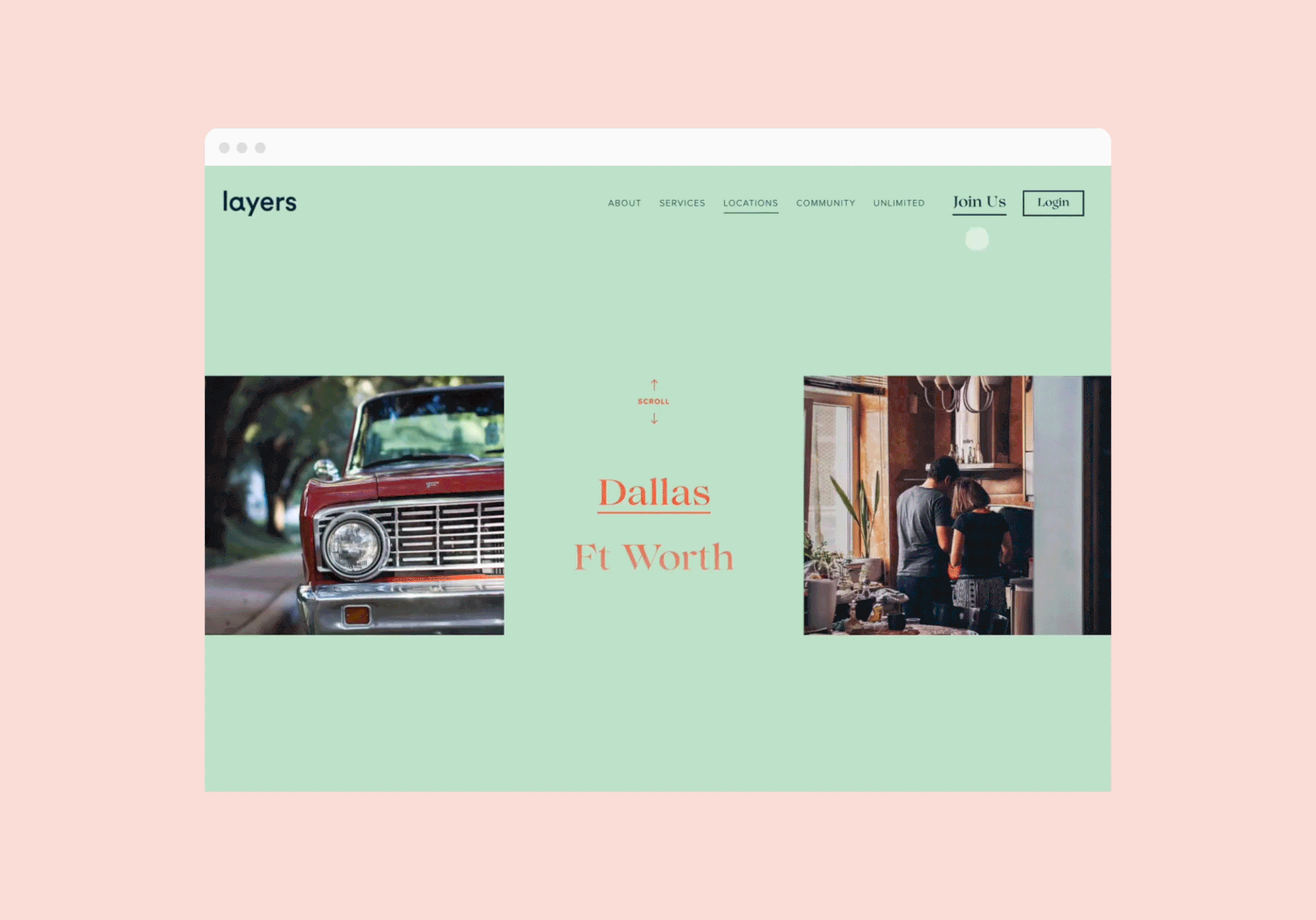
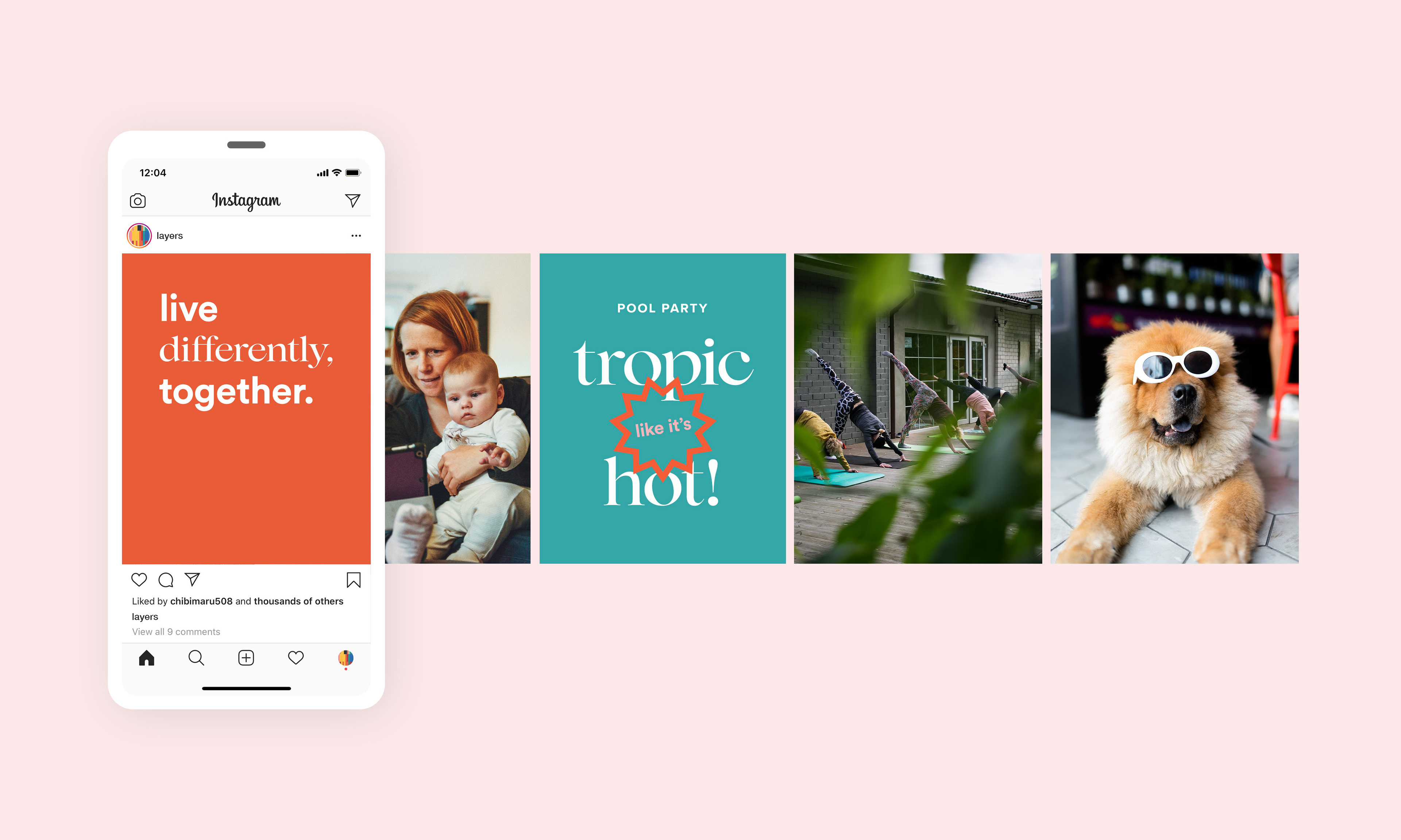
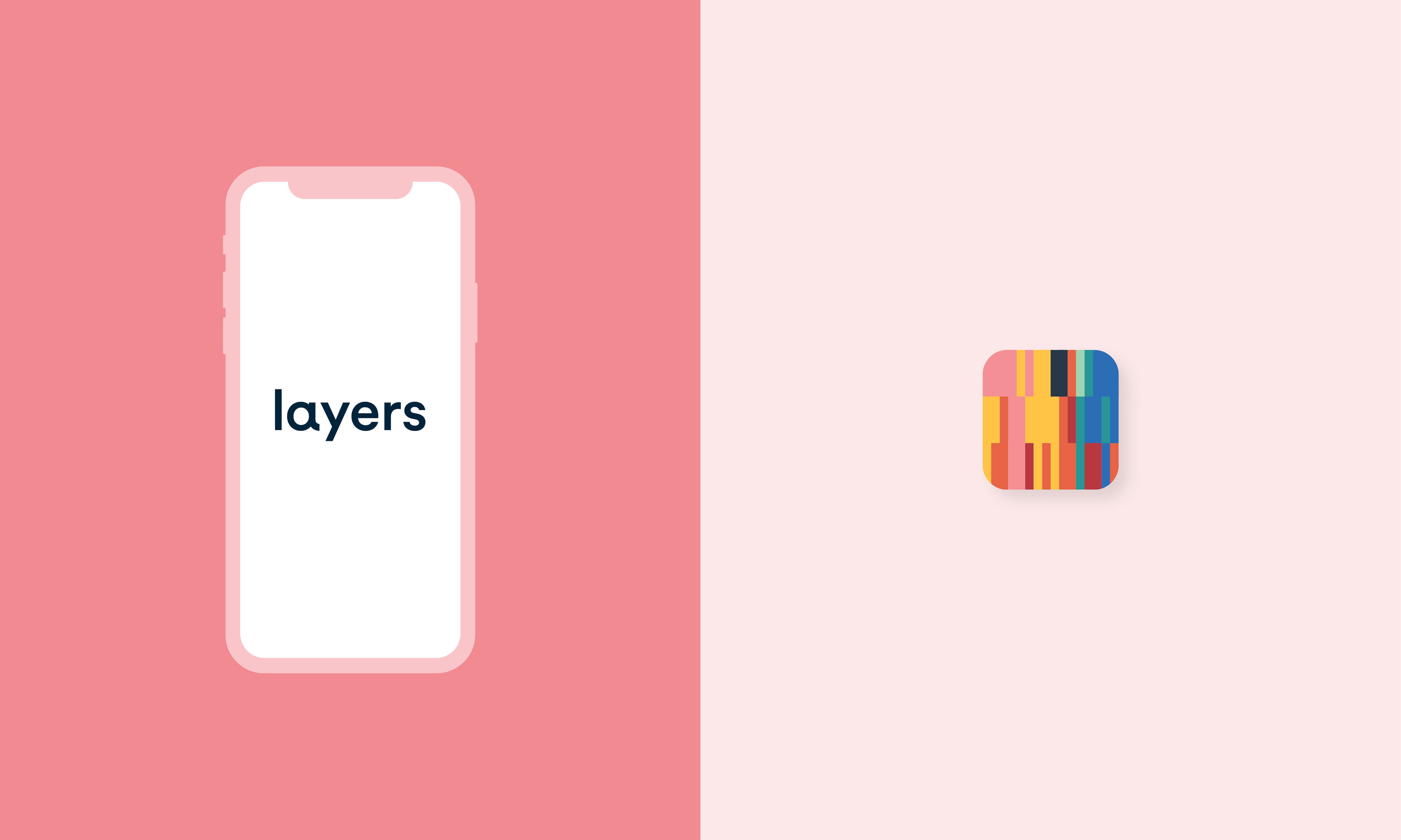
The creative direction centered around a simple truth: strong communities are made of many different people, stories, and rhythms. That insight led to the name Layers—a word that captures both individuality and cohesion, and evokes the richness of shared spaces.
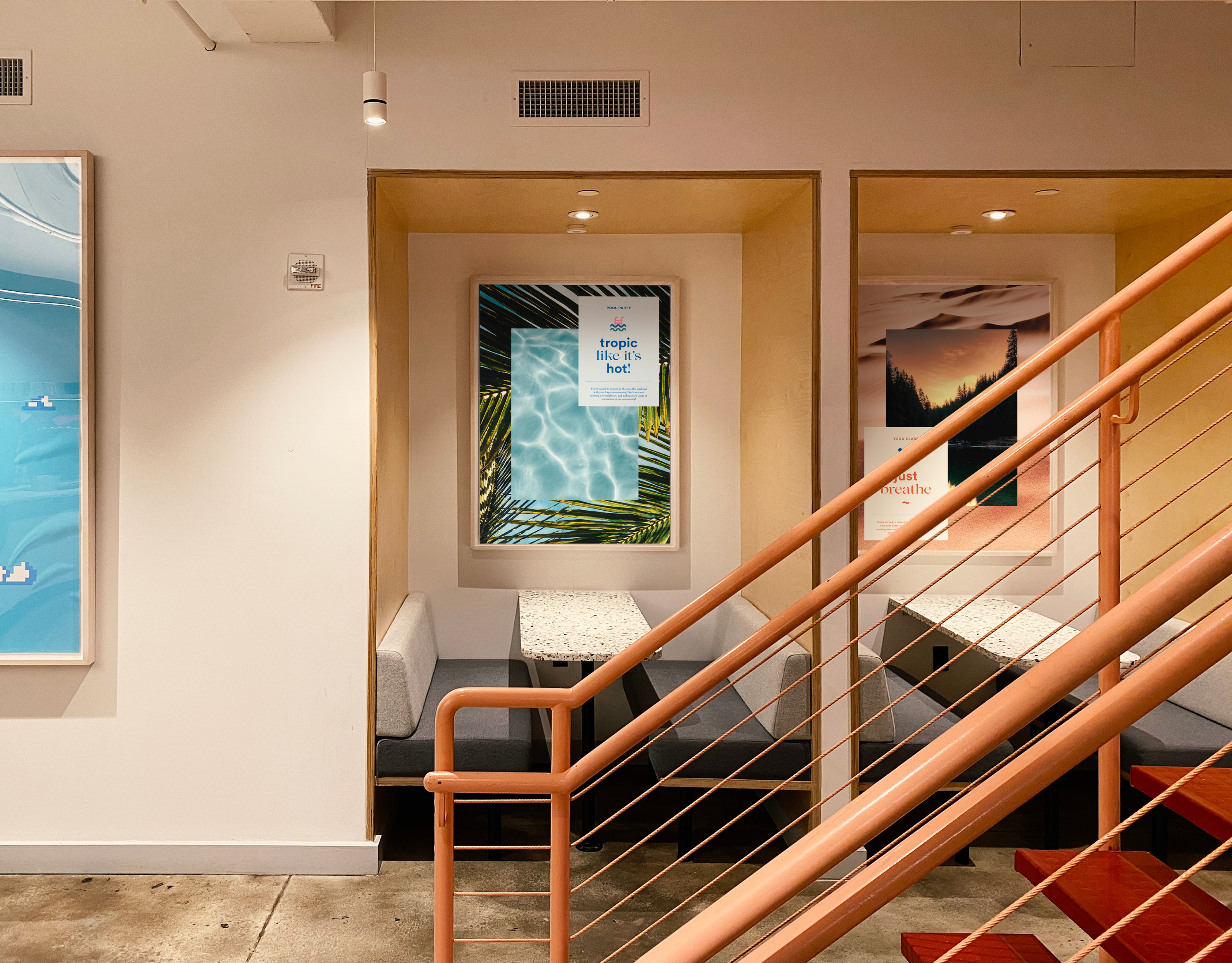
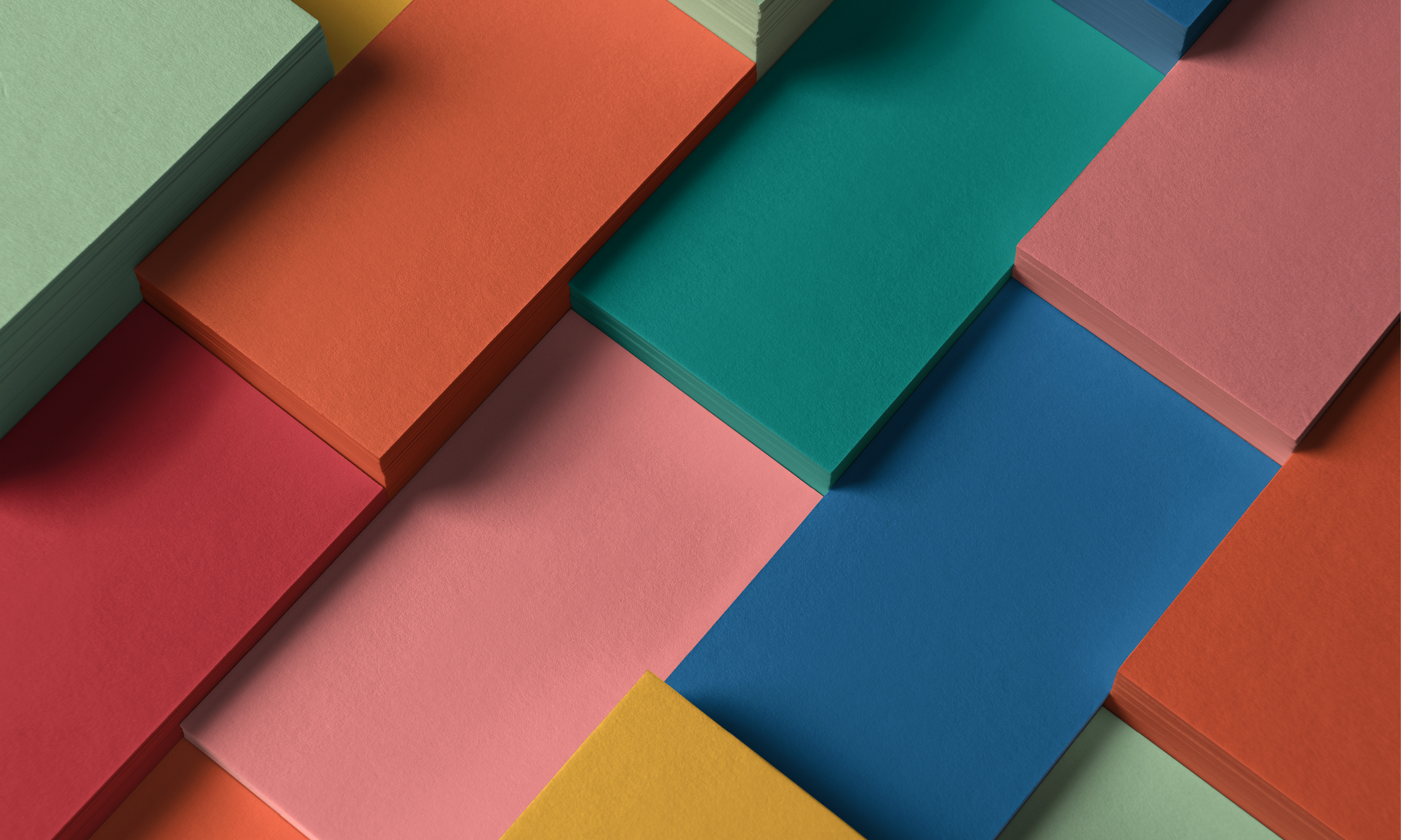
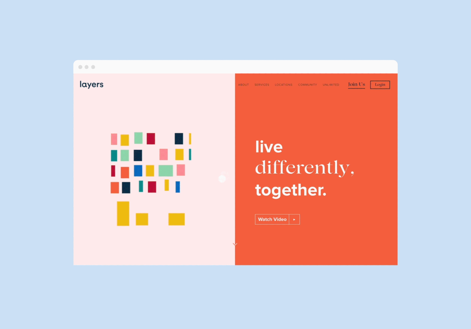
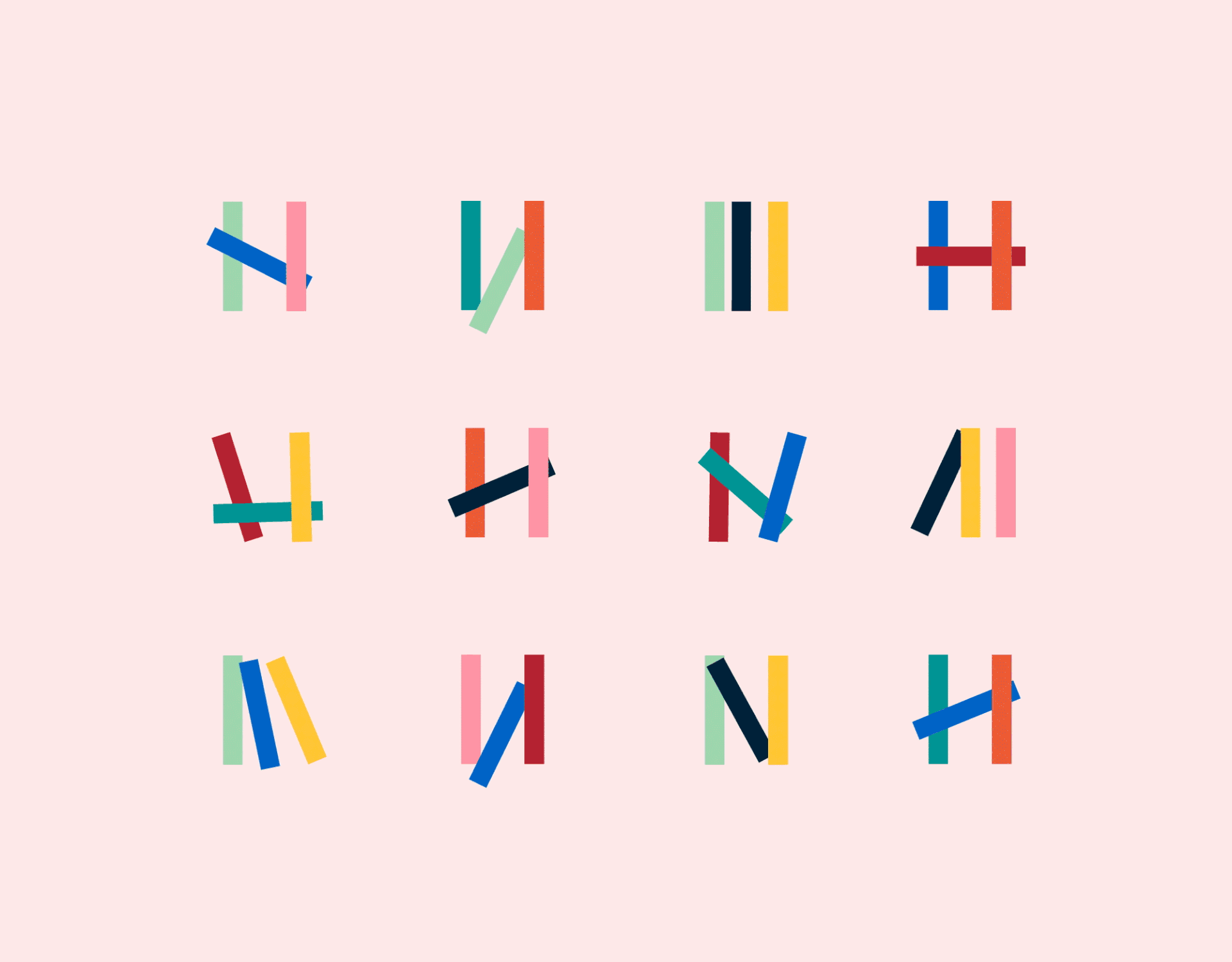
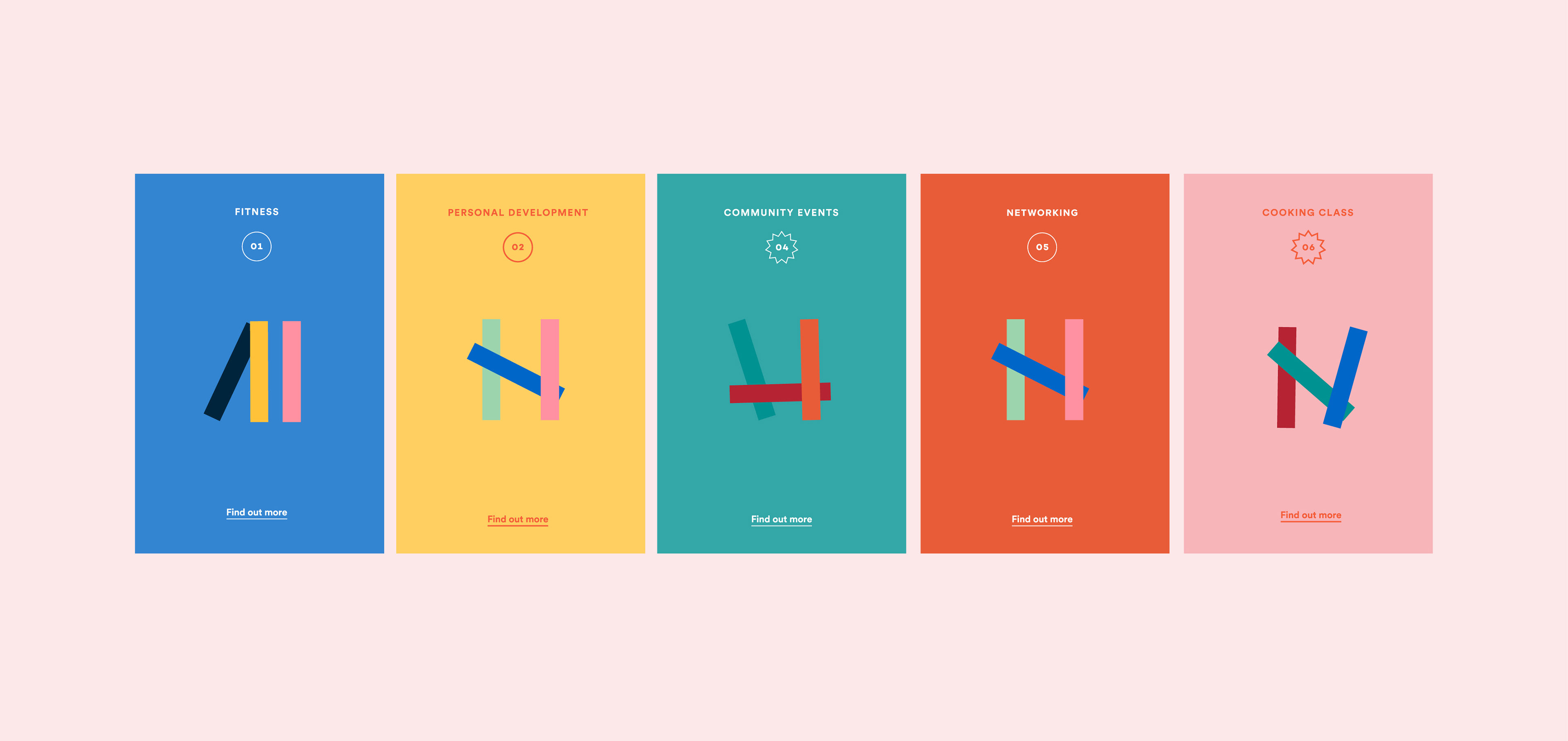
The visual identity took shape as a living system. A dynamic mosaic became the foundation—colorful, modular, always in motion. This wasn't just aesthetic; it served as a narrative device and an interactive framework, especially in digital, where it helped organize content, stories, and navigation in a way that felt fluid and human.
What emerged was a brand that could flex and evolve just like the residents it represents. Every element—name, color, motion, typography—was designed to hold personality, without losing structure. A brand that feels less like a product, and more like a place.
__
Naming, Brand Strategy, Brand Identity, Web Design