Overview
As part of its expanding ancient grains line, Pereg Natural Foods introduced a heart-healthy quinoa cereal designed to bring a playful, sweet crunch to the breakfast table. This launch marked a fun-loving twist on the brand’s protein-packed pantry staples—inviting a younger audience and adding a burst of personality to the product lineup.
Approach
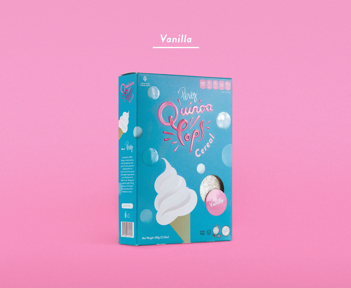
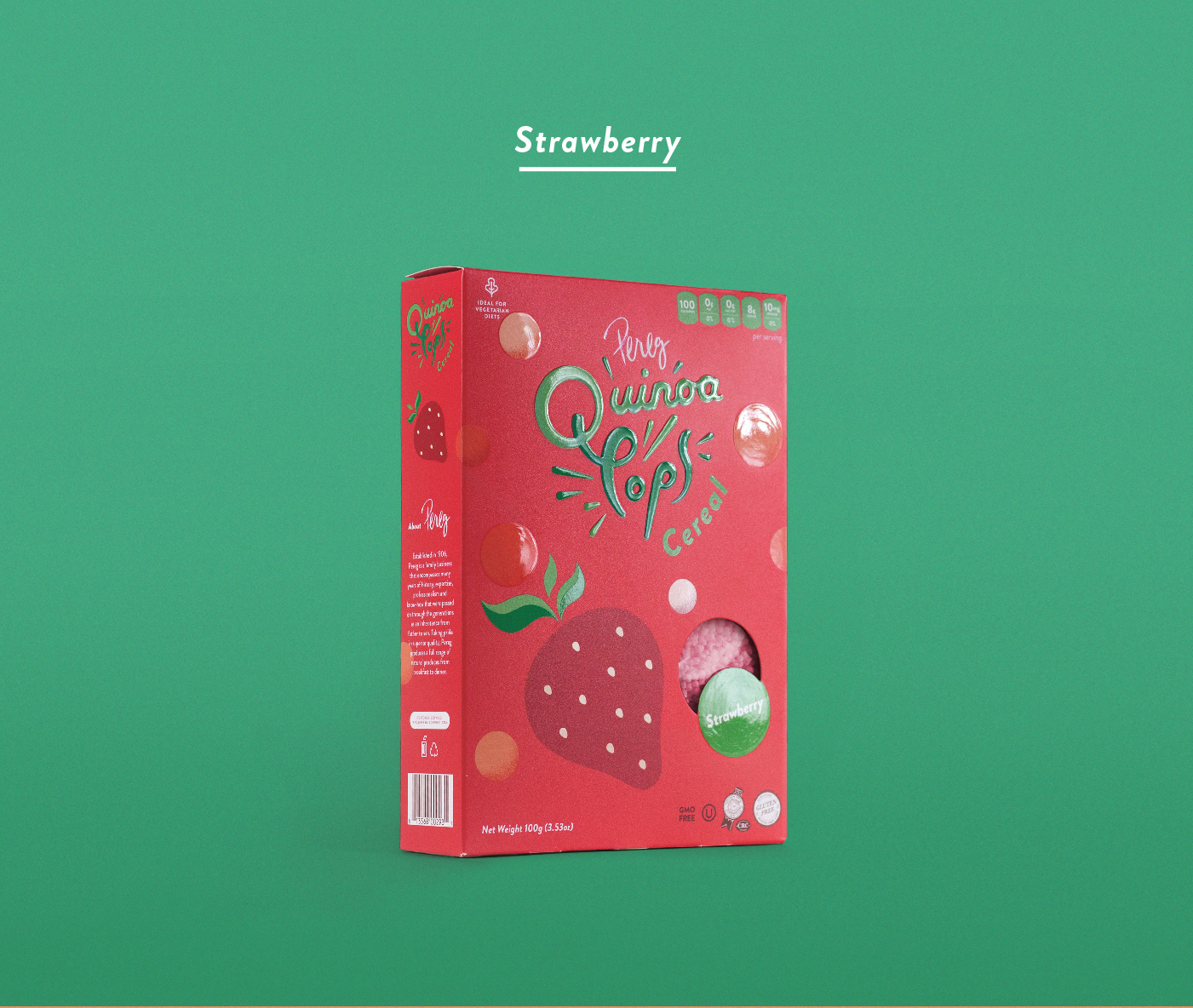
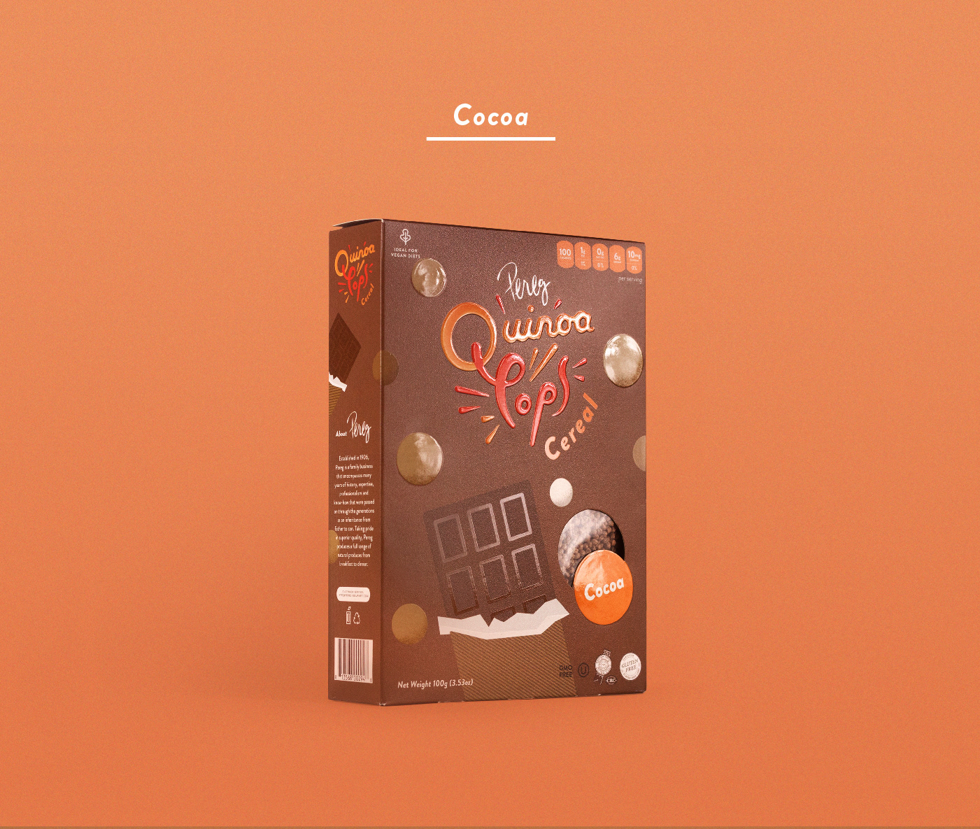
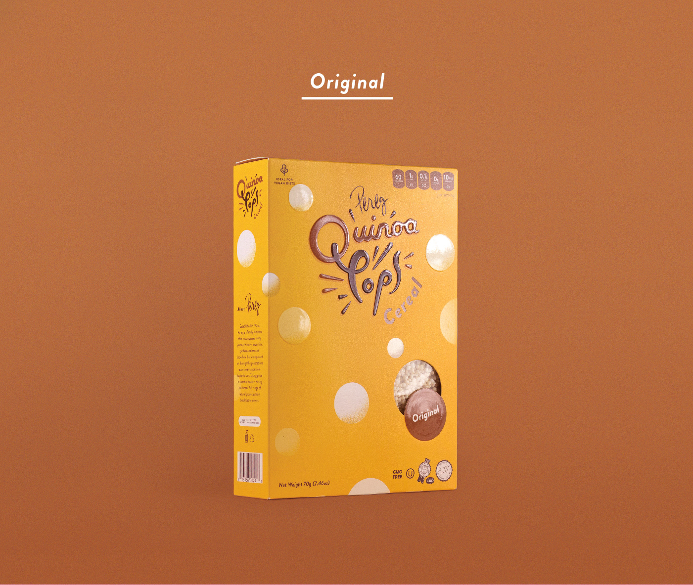
To reflect the lighthearted spirit of the cereal, I created packaging that feels joyful and bold. Eye-catching colors and lively illustrations capture the sweet flavor and airy texture of the pops. The logo was crafted in expressive calligraphy, paired with blind embossing to give it a raised tactile presence—mimicking the pop of each spoonful.
The overall visual language blends energy with approachability, staying true to the natural food values of the Pereg brand while introducing a more playful, shelf-grabbing moment in the cereal aisle.
__
Brand Identity, Packaging Design