Overview
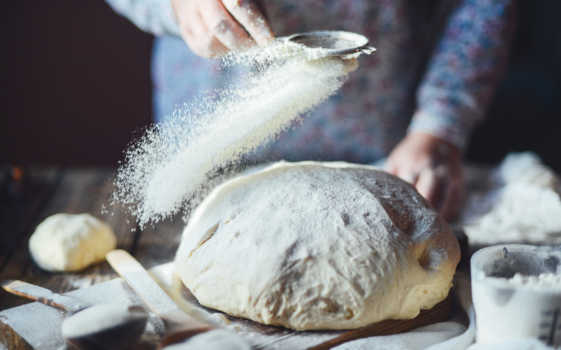
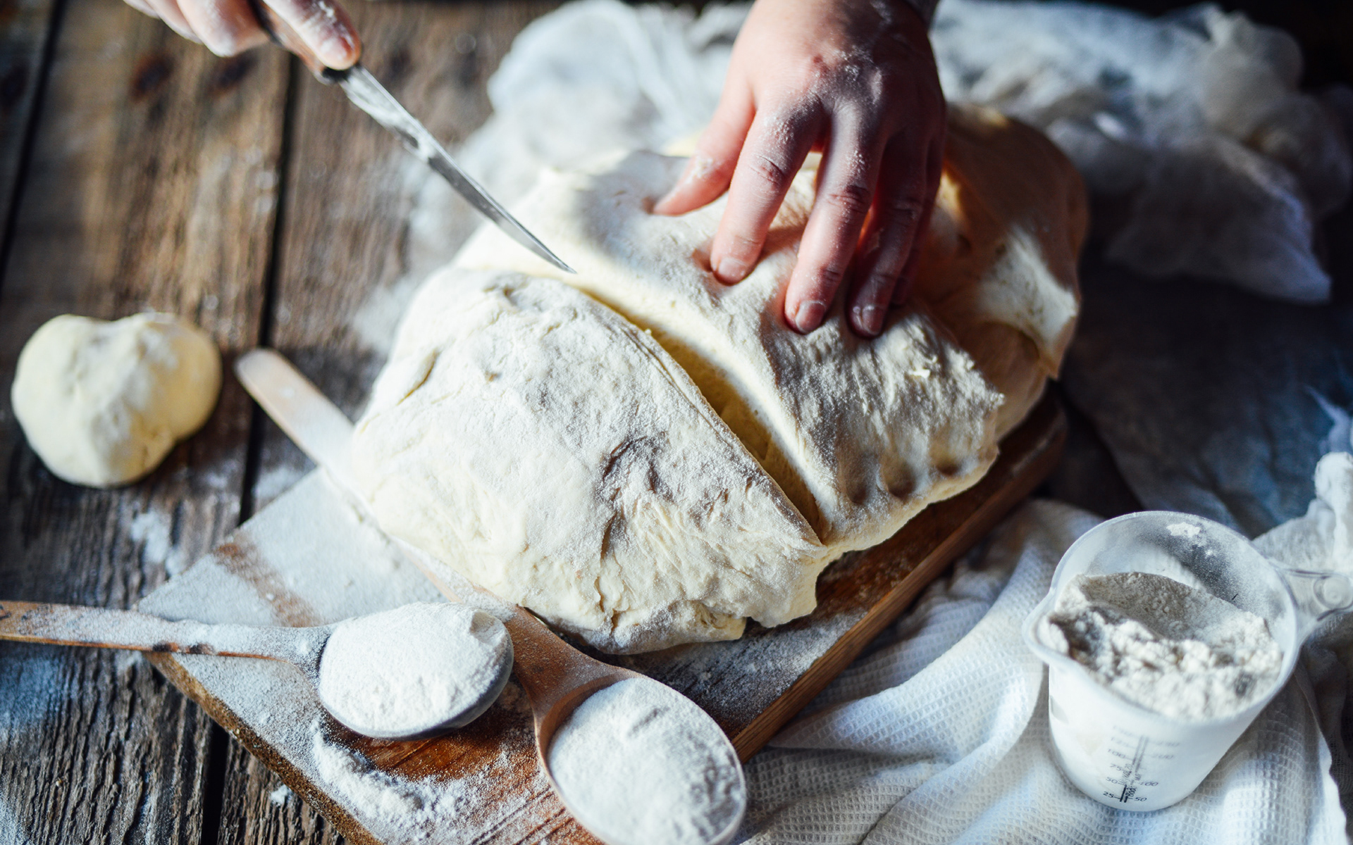
Pereg Natural Foods has spent over a century sourcing all-natural, high-quality ingredients from around the world. As the company expanded from Israel into the U.S. market, it faced the challenge of introducing an unfamiliar audience to a range of Israeli-style product lines—most recently, an extensive collection of multi-purpose flours with unique flavor profiles and uses.
Approach
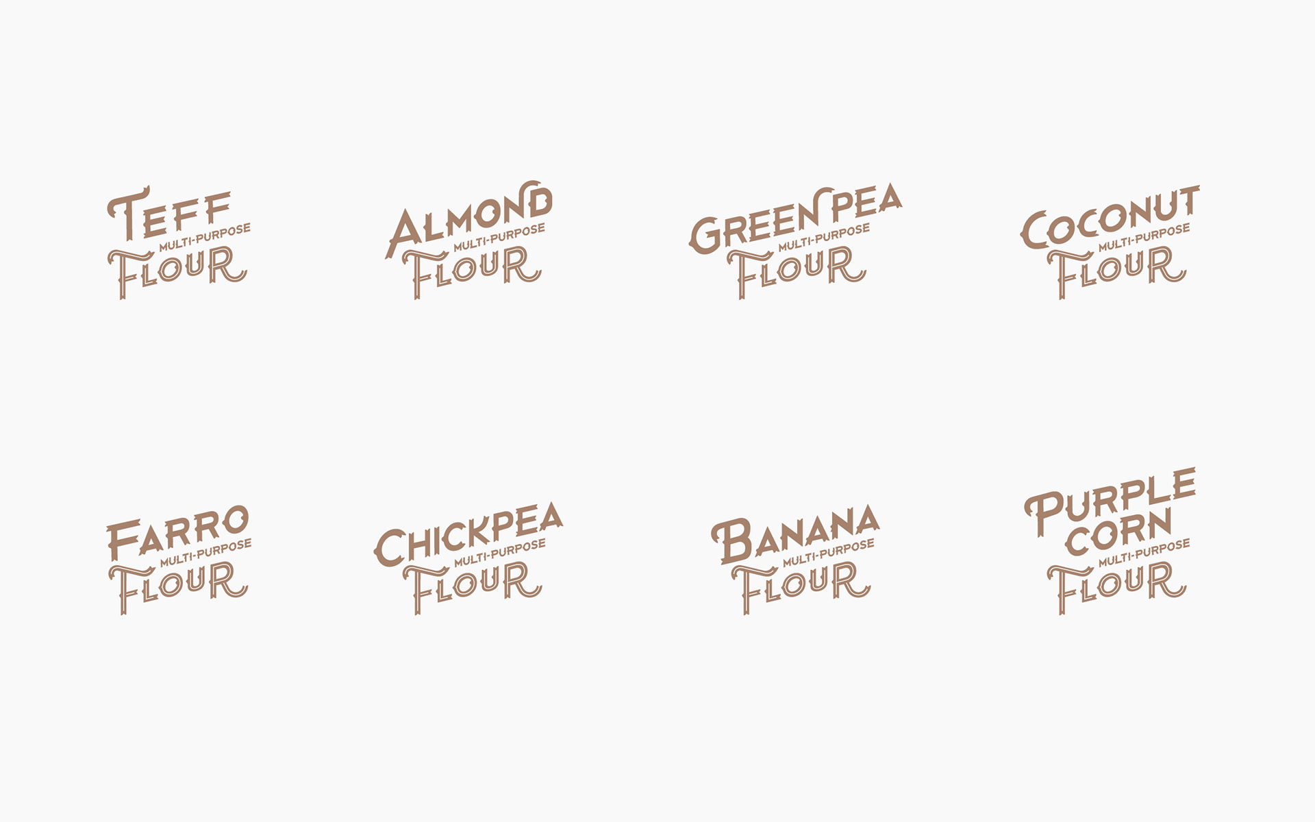
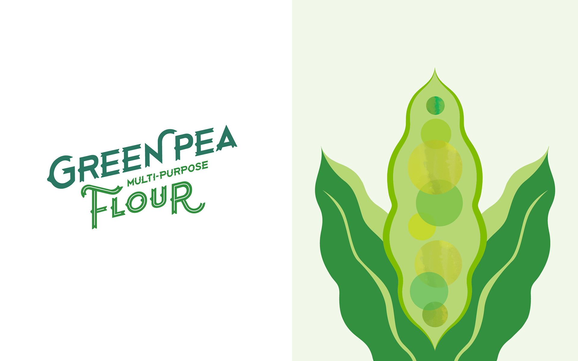
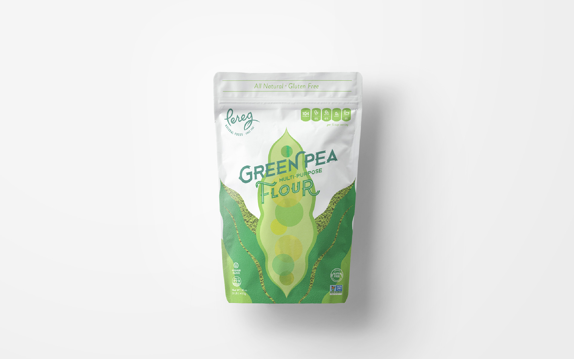
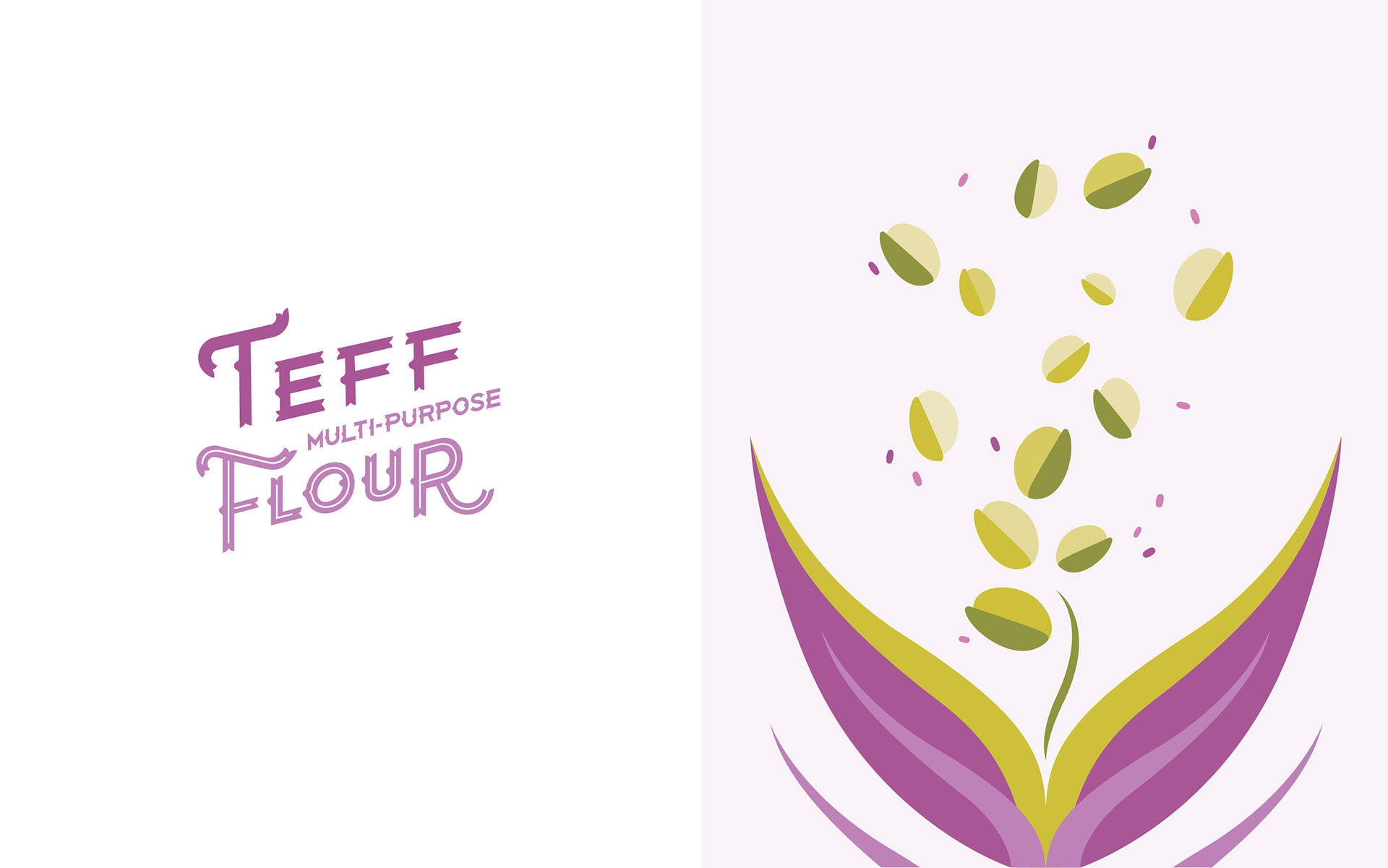
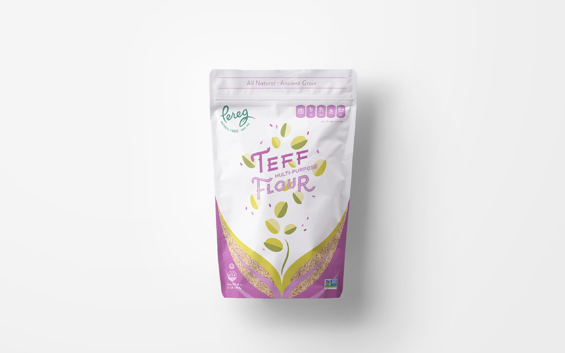
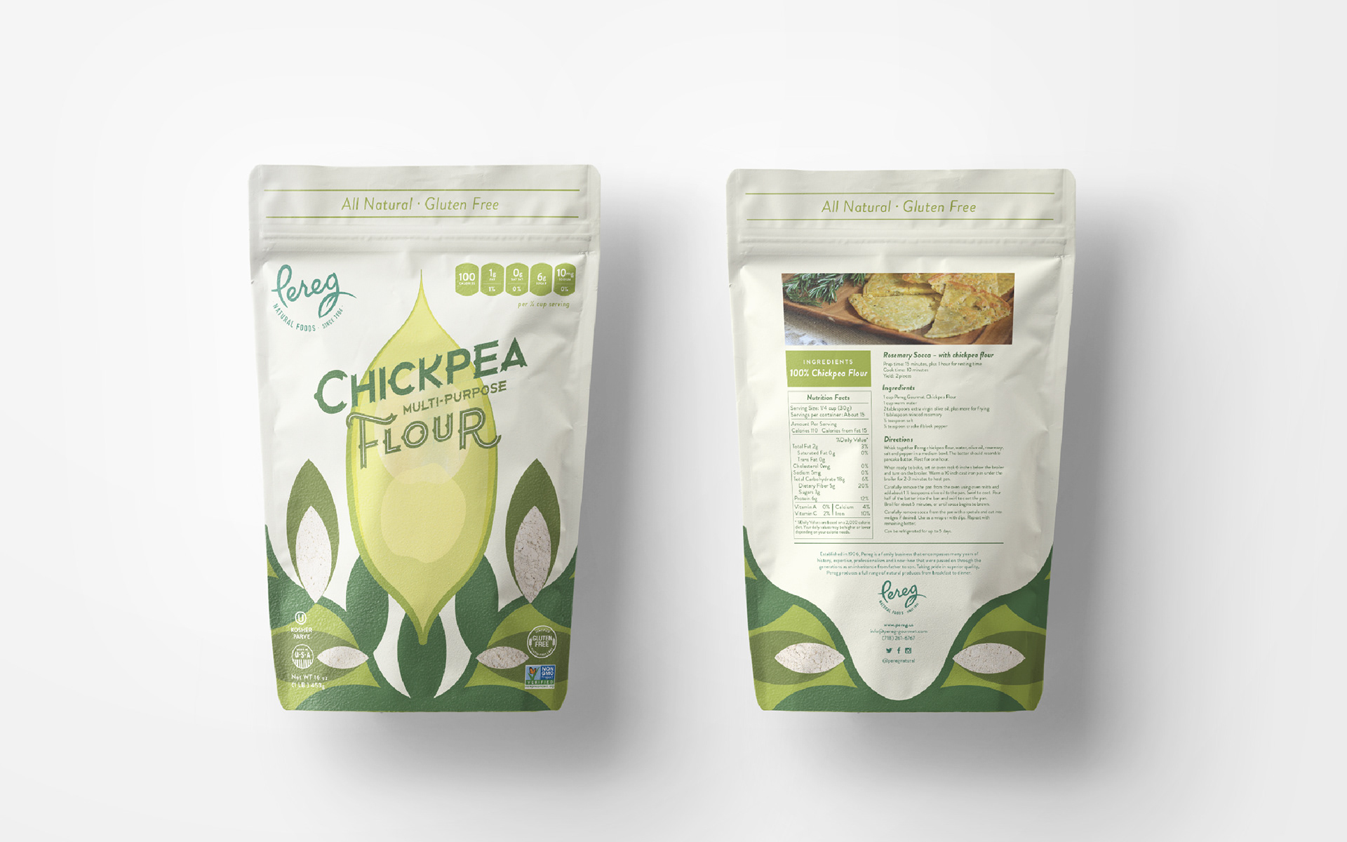
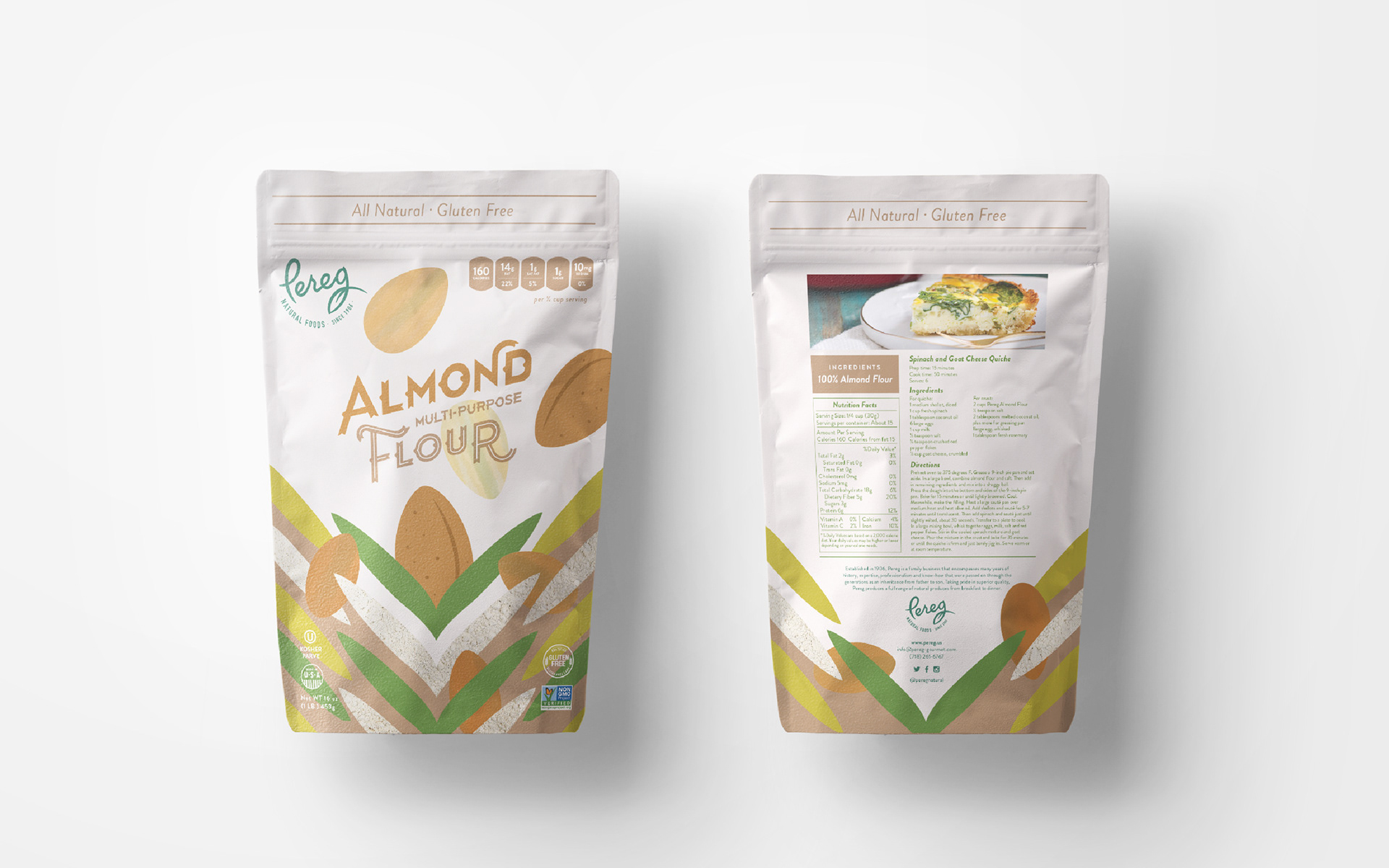
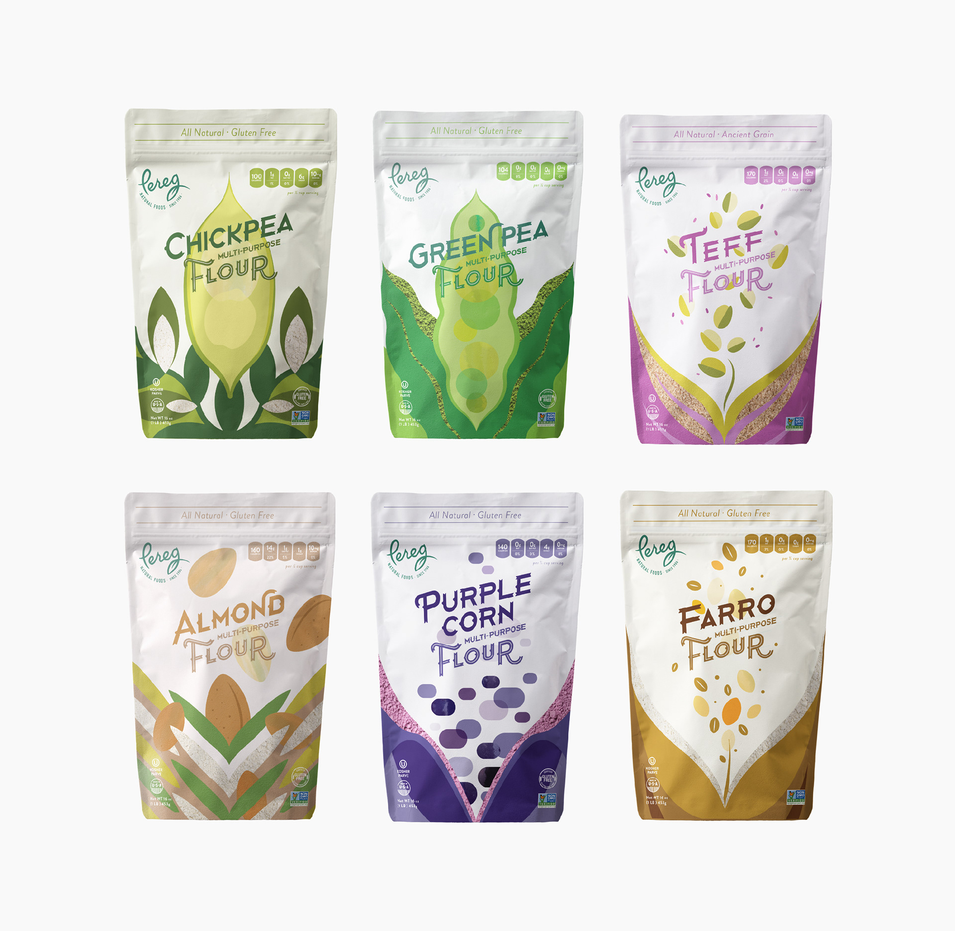
To help Pereg break through on shelves and spark curiosity among American consumers, I developed a packaging system that felt both playful and premium. The logotype was built from a custom typeface—its ridged edges and weight inspired by the organic structure of whole foods.
Vibrant illustrations and abstract forms reflected the character and purity of each flour variety. These elements were composed to feel fluid and dynamic, as if the ingredients themselves were pouring directly into the packaging from the fields. Carefully placed windows created a visual link between illustration and product—highlighting texture, transparency, and authenticity: what you see is what you get.
The color palette, form language, and tactile layout worked together to present Pereg’s flours as both approachable and high-quality. Since launch, the new packaging has helped secure distribution with major U.S. retailers and contributed to a noticeable rise in national brand awareness.
__
Brand Identity, Packaging Design