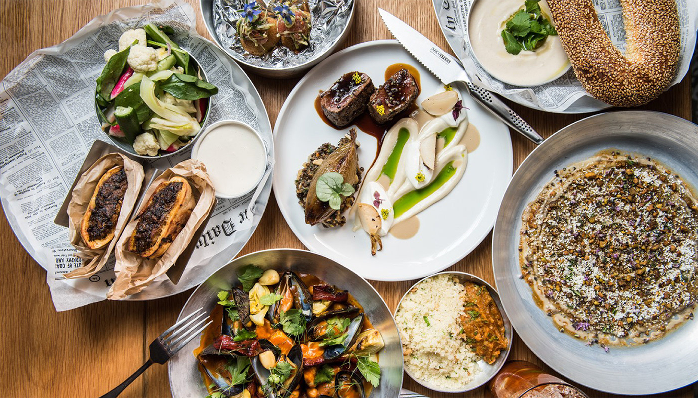
Overview
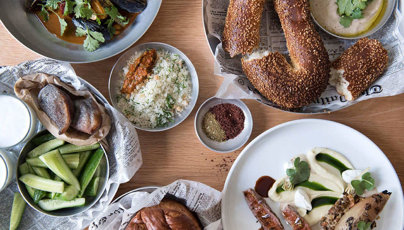
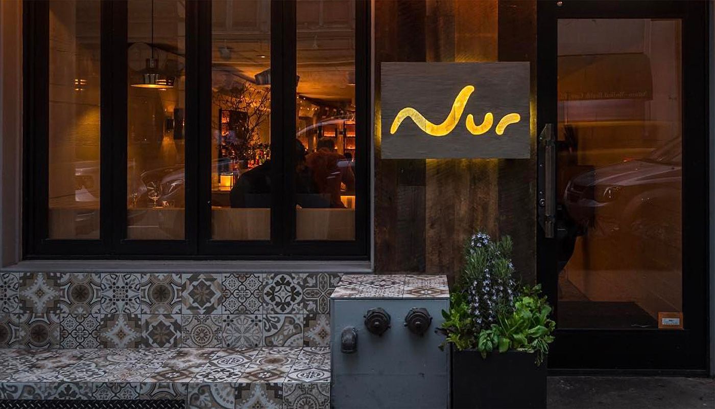
Nur—meaning “light” in Hebrew and “flame” in Arabic—is the first New York venture from acclaimed Israeli chef Meir Adoni. Positioned as a brasserie-style restaurant, Nur set out to introduce bold, elevated interpretations of Middle Eastern street food to the city's refined culinary scene. The brand needed to express this unique cultural fusion with warmth, depth, and modernity.
Approach
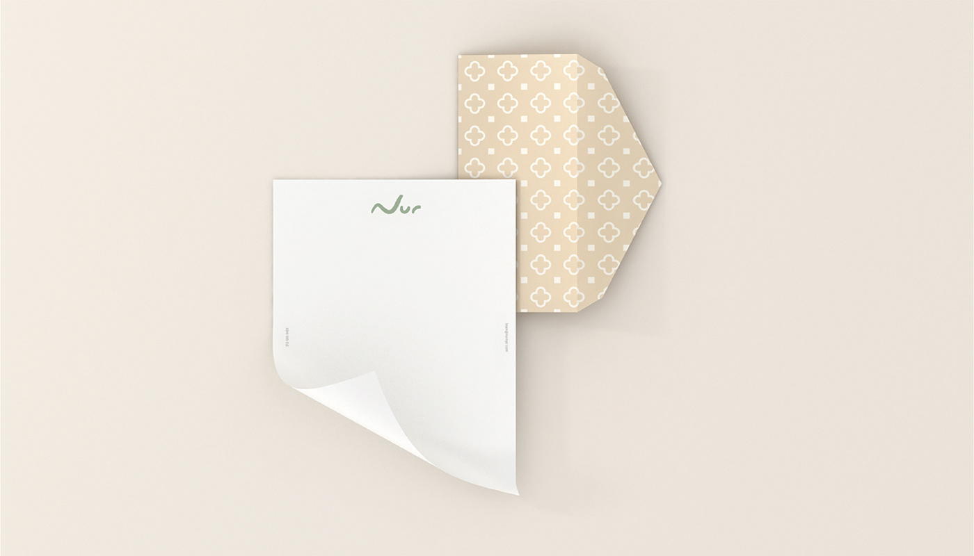
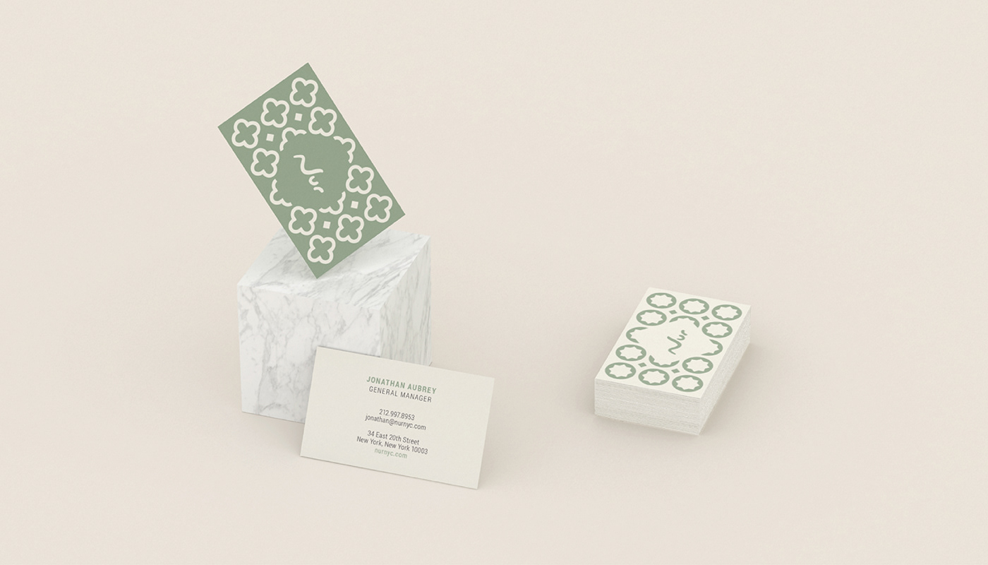
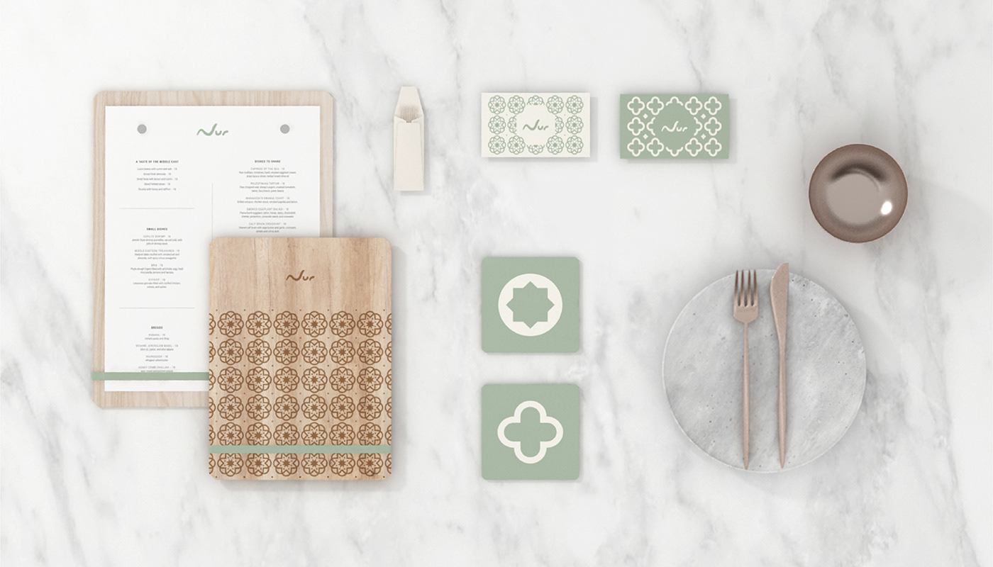
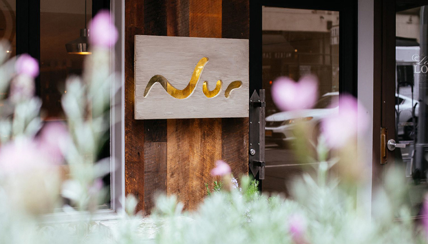
The brand identity drew inspiration from the personal, ever-evolving nature of Adoni’s cuisine. The custom logotype was designed to feel like a handwritten signature—fluid, continuous, and alive. Its single-stroke form symbolizes both movement and transformation, much like the menu itself, which changes with each visit. The curves of the “N,” “U,” and “R” loop into one another, suggesting waves of flavor, rhythm, and connection.
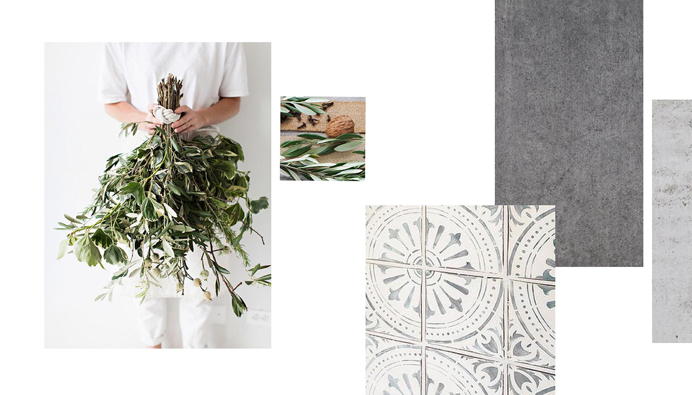
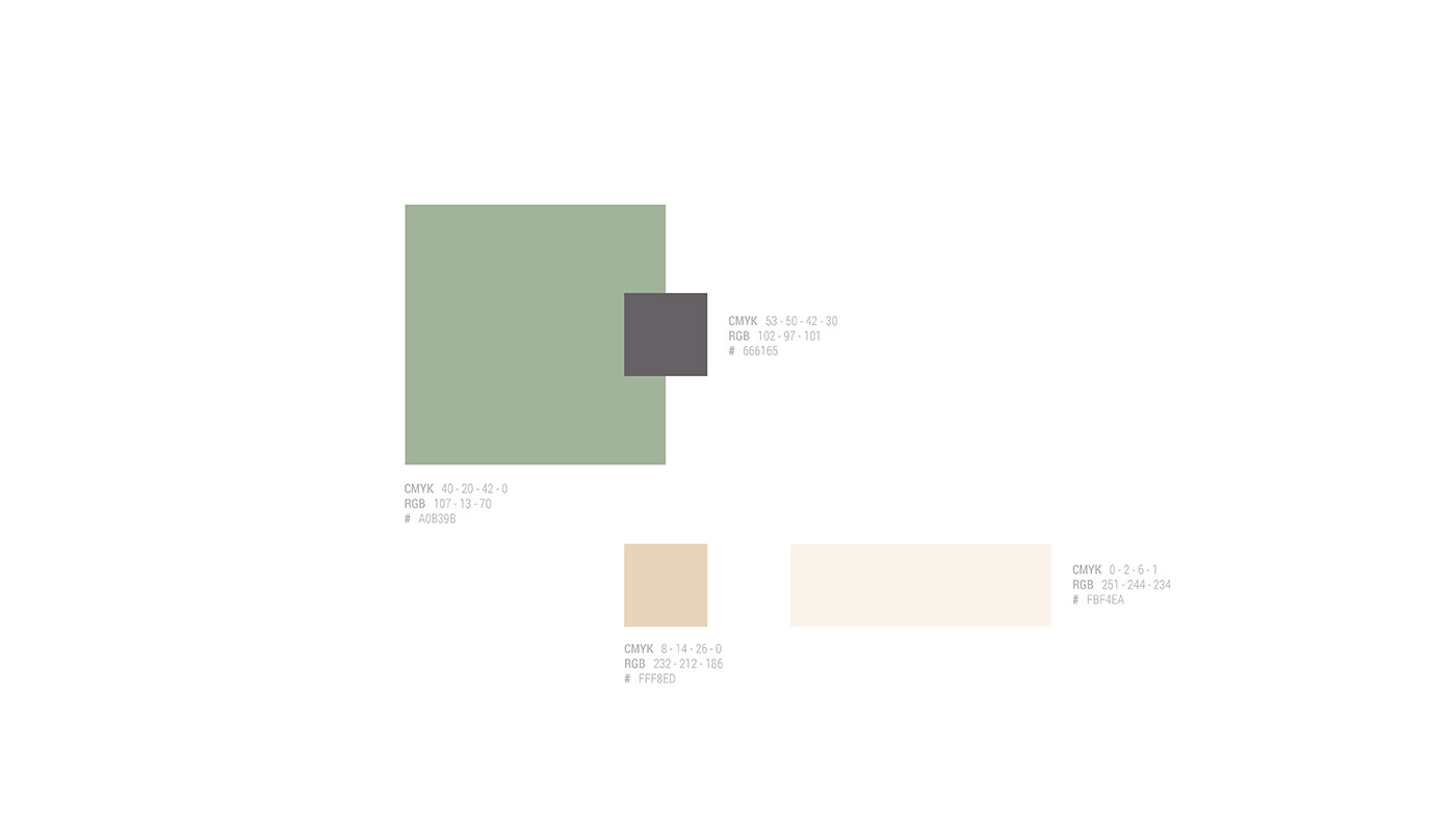
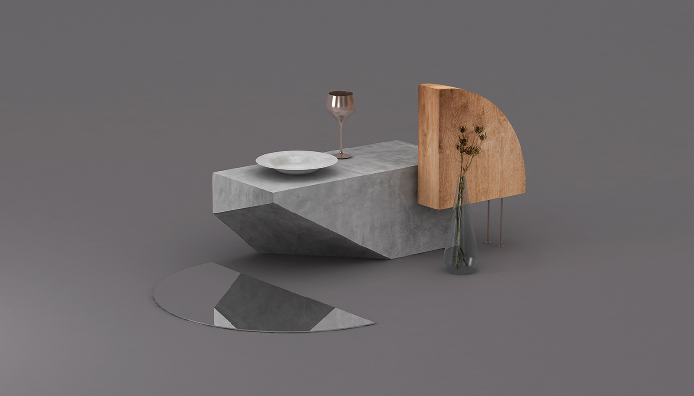
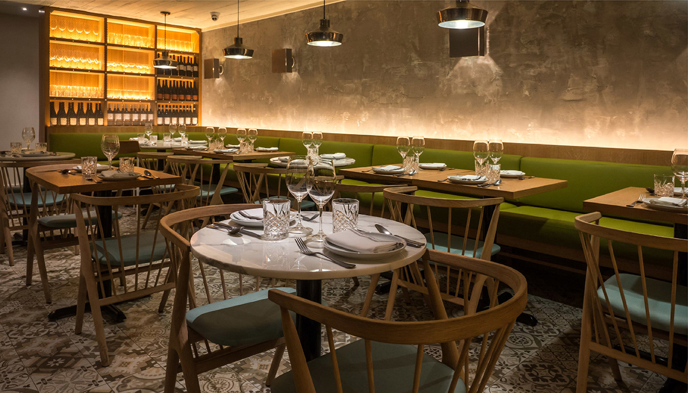
The color palette remained grounded in natural tones—white, cream, soft gray, and green—offering a modern take on Mediterranean aesthetics. These hues allowed the food and textures of the space to take center stage, without overwhelming the sensory experience.
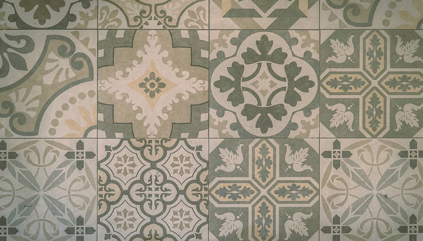
Minimalist graphic patterns, inspired by traditional Mediterranean tiles and textiles, were integrated into print collateral and interior elements. These were thoughtfully simplified to feel current, yet still anchored in cultural memory—timeless forms that carry the weight of history without appearing nostalgic.
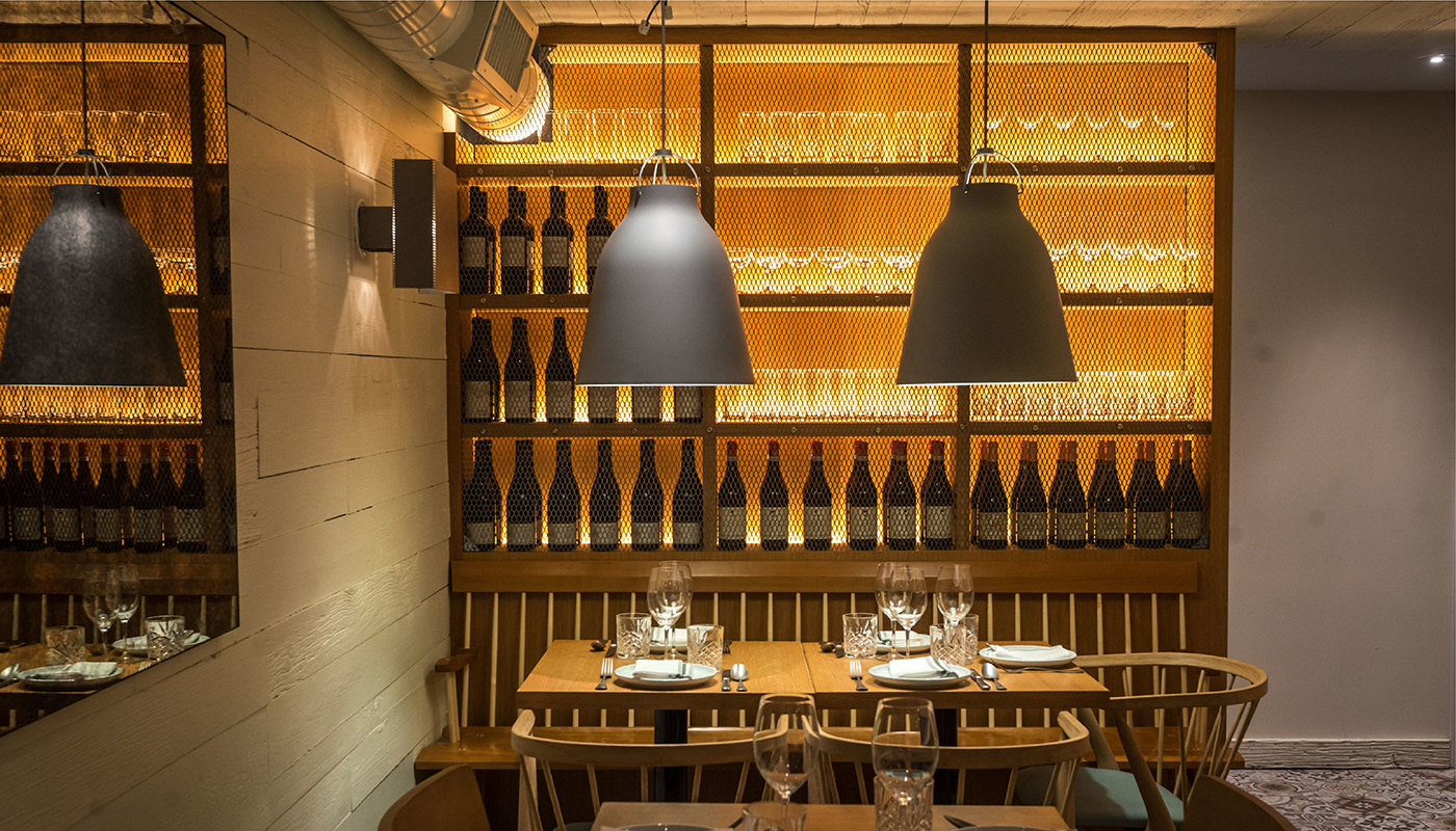
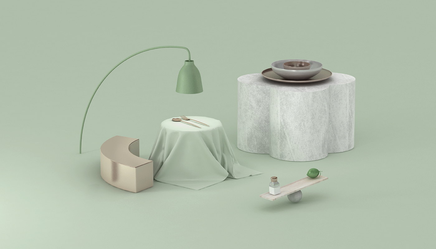
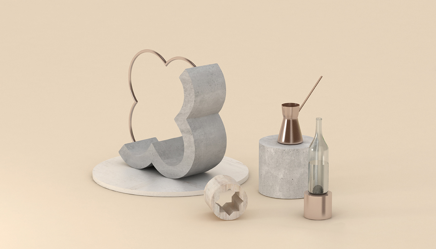
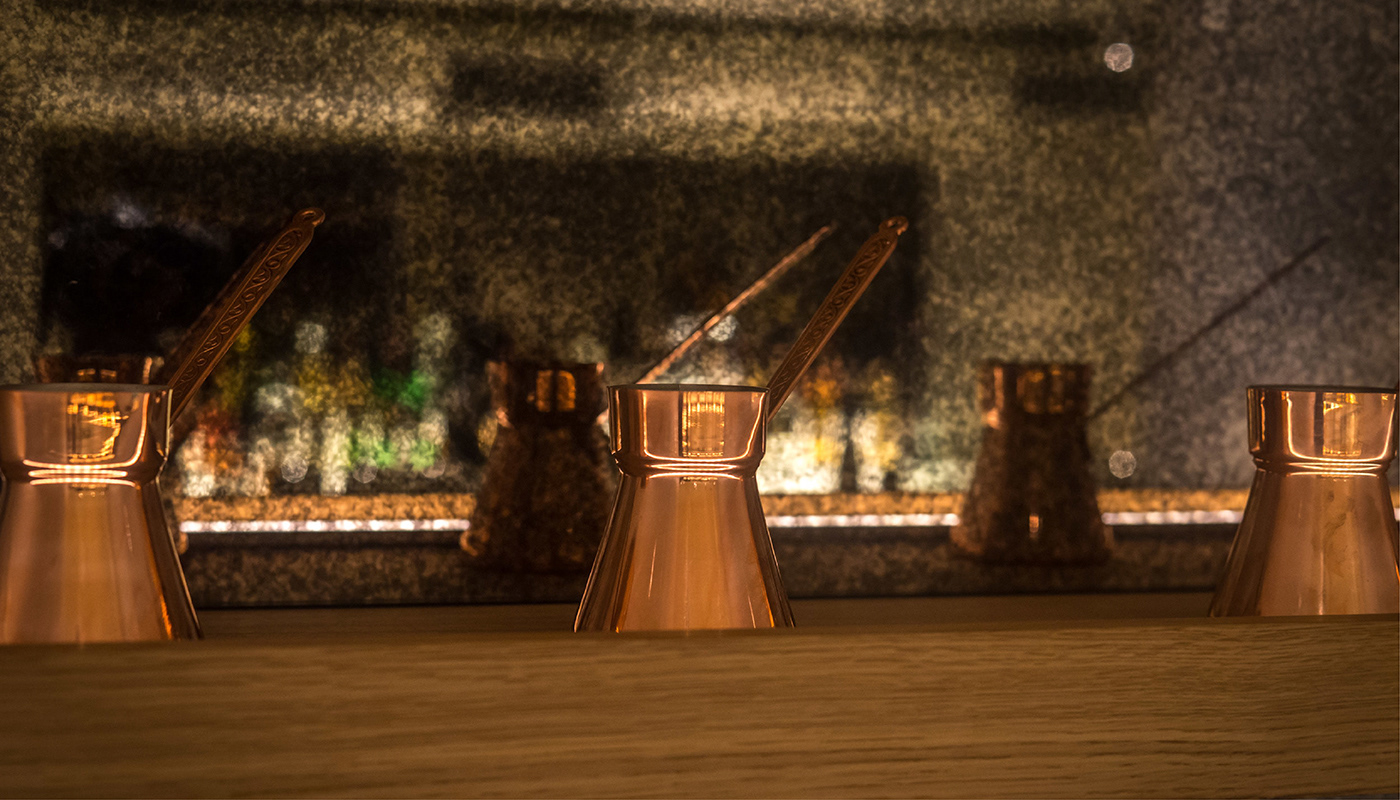
To bring the tactile essence of the restaurant forward, print materials incorporated textures like washed wood, cement, and soft rubber. These surfaces balanced clean lines with earthiness, creating a quiet elegance that mirrors the atmosphere of the space. The design invites guests to focus on what matters most: the craftsmanship, the stories in the spices, and the unexpected joy in every dish.
__
Brand Identity, Interior Decor